We created the complete brand identity from conception to implementation. We combined elements from the world of start-ups with elements of the umbrella brand. The result is a bright, digital presence that works on all devices.
Appearance of a Corporate Innovation Unit
Eberspächer Nextshed

briefing
The Eberspächer company has created its own Corporate Innovation Unit. The goal was to clearly position and establish this new brand. Together with the client, we developed values, mission and vision in a brand process. And transferred the results into our brand model in order to build the new brand from them. The result is a bold appearance that builds a bridge to the Eberspächer umbrella brand.
Categories
Industry, Start-up
Visit Site
www.nextshed.io
Successful digital presence


An umbrella for the brand
The logo was also developed especially for the new brand and combines old and new. The shed roof is the visual bracket that creates the reference to the umbrella brand.
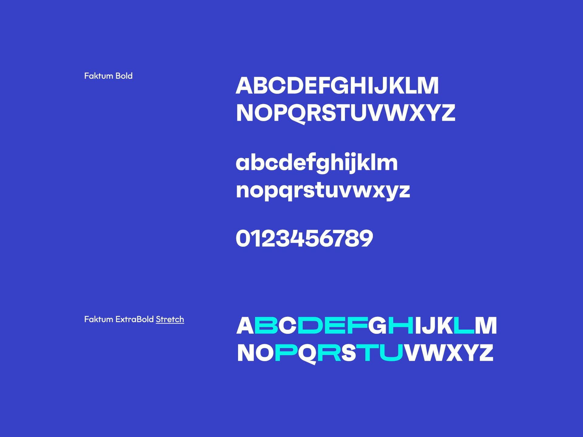
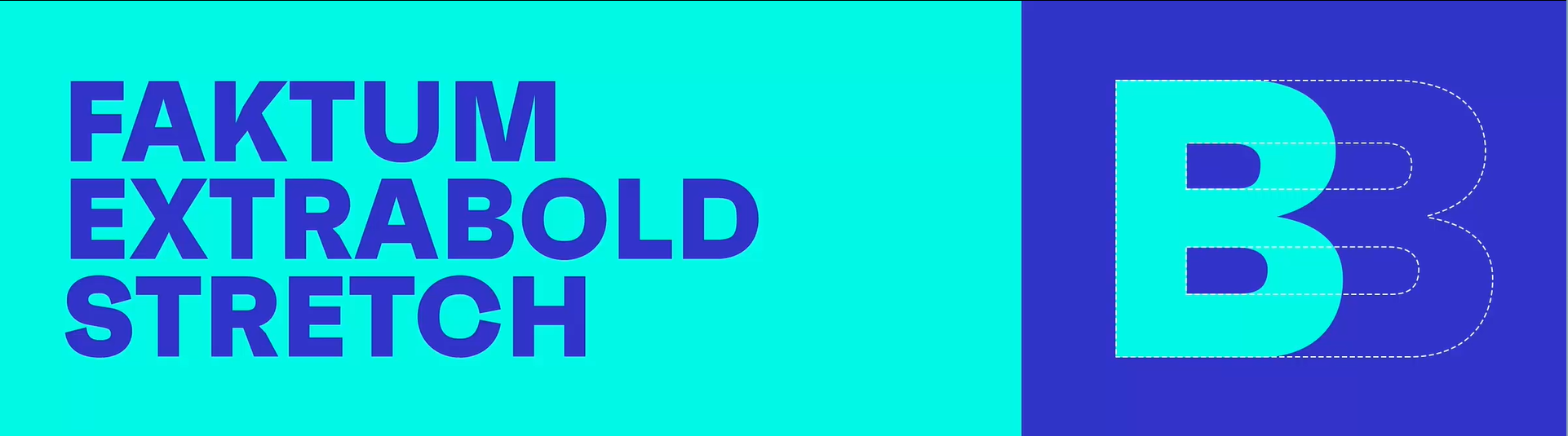
Typo full of energy
The Eberspächer Innovation Unit stands for agility and energy. We also emphasise this with our typography. The basis for this is the idea of kinetics, which brings movement into the company - and its contents. Even when stretched, the typeface retains its clarity.
Everything considered
The icon world shows the lively diversity of our design, even on a small scale. The lines and shapes can be used statically and in motion and simplify messages and content.

Colours of innovation
Deep Blue
- R 55
- G 65
- B 201
#3741C9
Fresh Turquoise
- R 0
- G 246
- B 234
#00F6EA
New Business
Together to the next level.