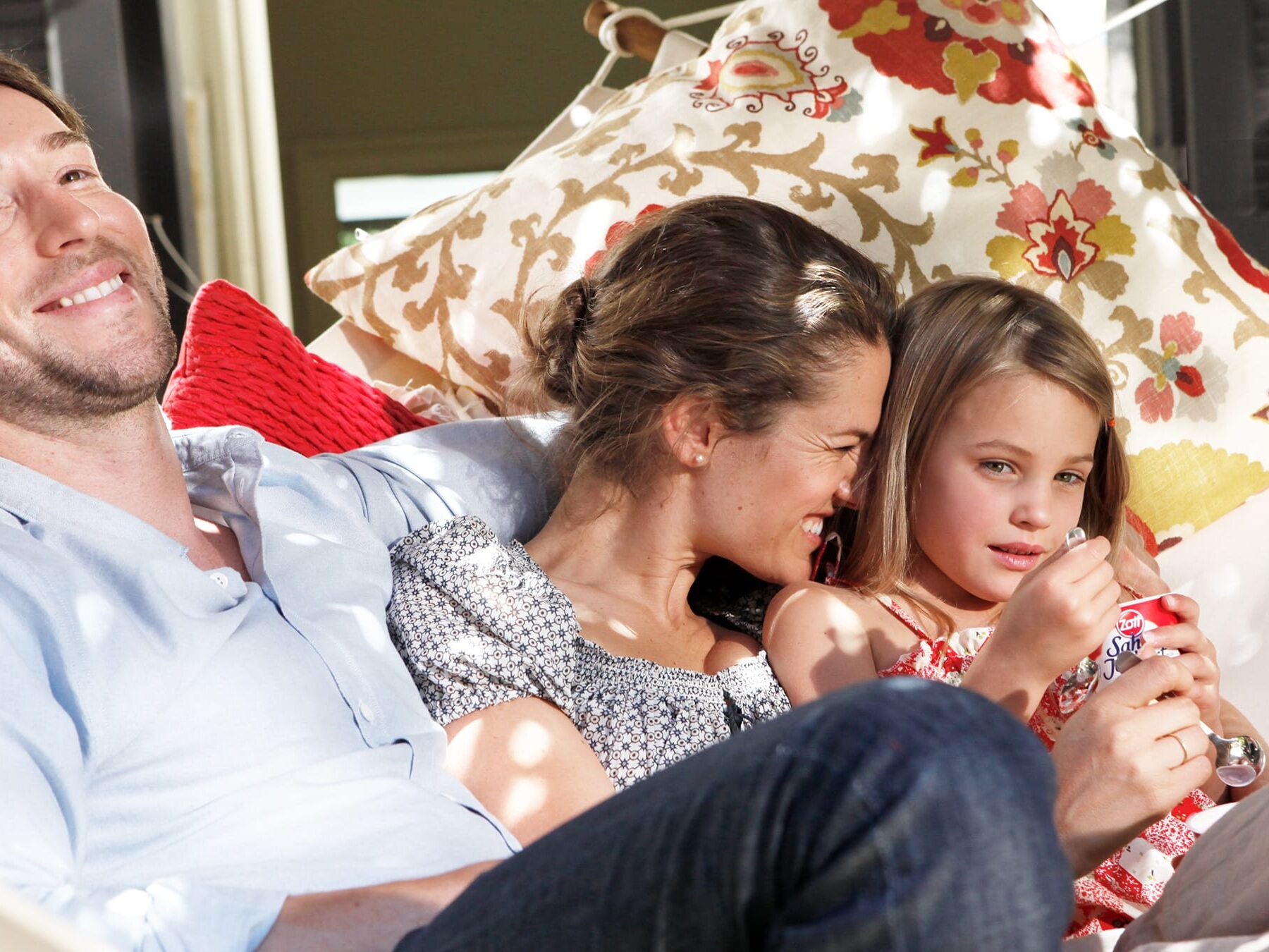
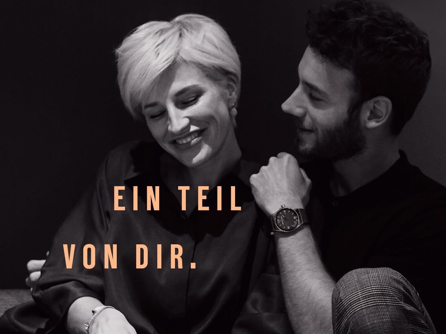
The emotional stories behind each piece of jewellery are the communicative vehicle and are played out and staged in a big way on the website. With messages that address the feelings and not the status. In combination with the design we developed, a digital portal into the Kutter brand has been created that invites you to discover it.
Repositioning of a traditional brand
Kutter 1825
briefing
The Stuttgart jeweller E. Kutter was looking for a new image and wanted to position itself more clearly. In a joint branding process, we used our Brandrocket to fine-tune the brand. The result is a new name that confidently focuses on tradition and quality. To achieve this, we translated the values and vision of the brand into a corporate design that combines tradition and modernity. And from this we created a clear and independent communicative appearance.
Categories
Consumer
Visit Site
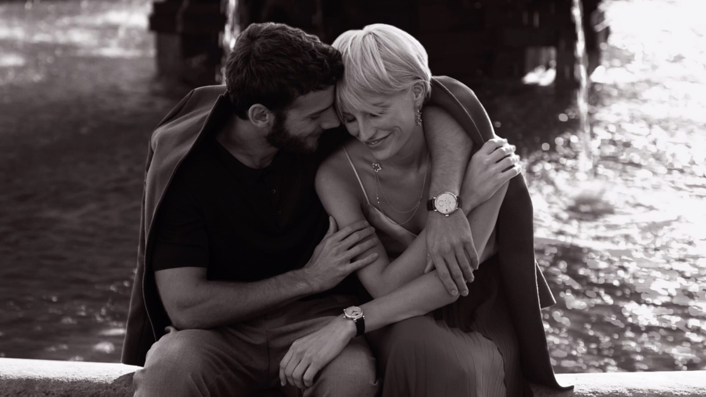
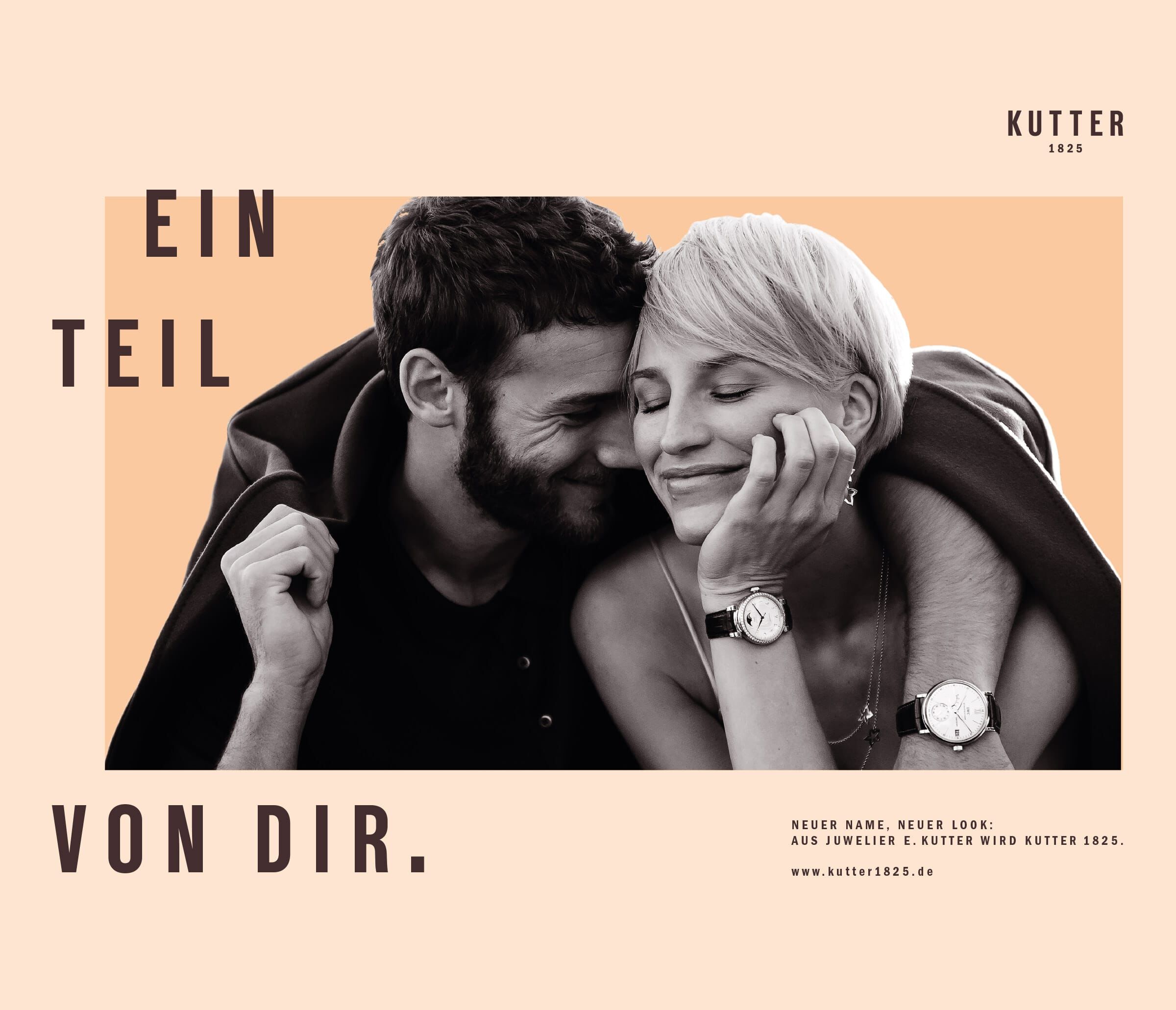
www.kutter1825.deA part of Kutter
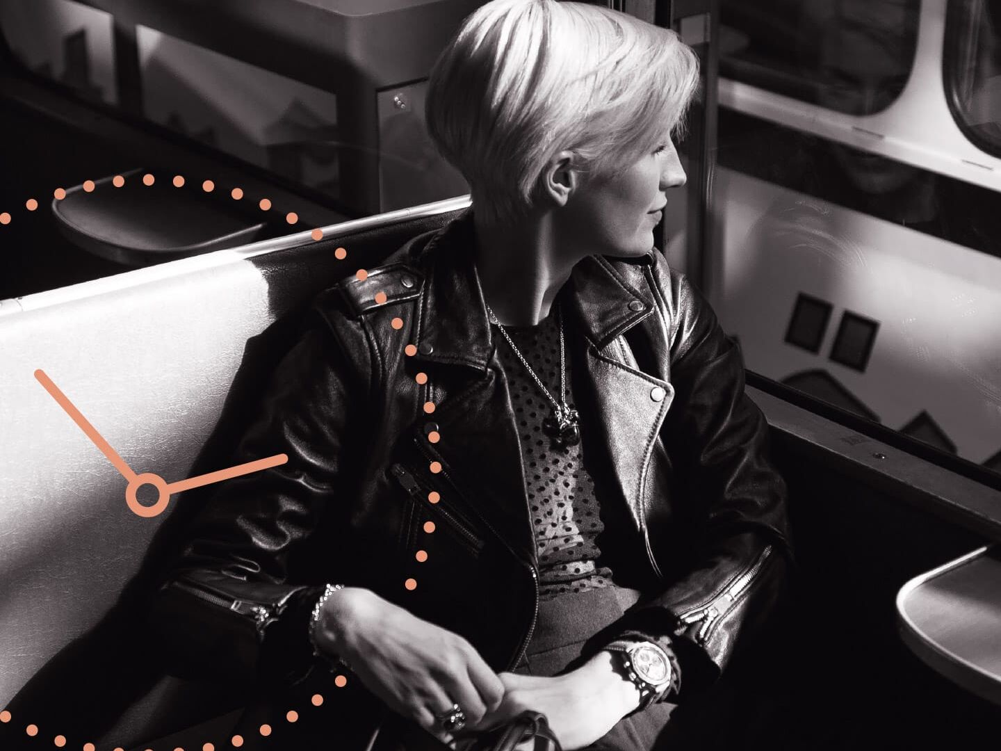
A detail from Kutter
The new image world and the corporate design were also conceived and created for mobile use from the very beginning. So that a web experience of the highest quality is also created on the move - in keeping with Kutter's products.
An image world for Kutter
We have also paid special attention to the imagery. The black and white images come alive with a little bit of movement. They are given a unique effect by graphic elements and the special colour world. And fill the brand world with life.
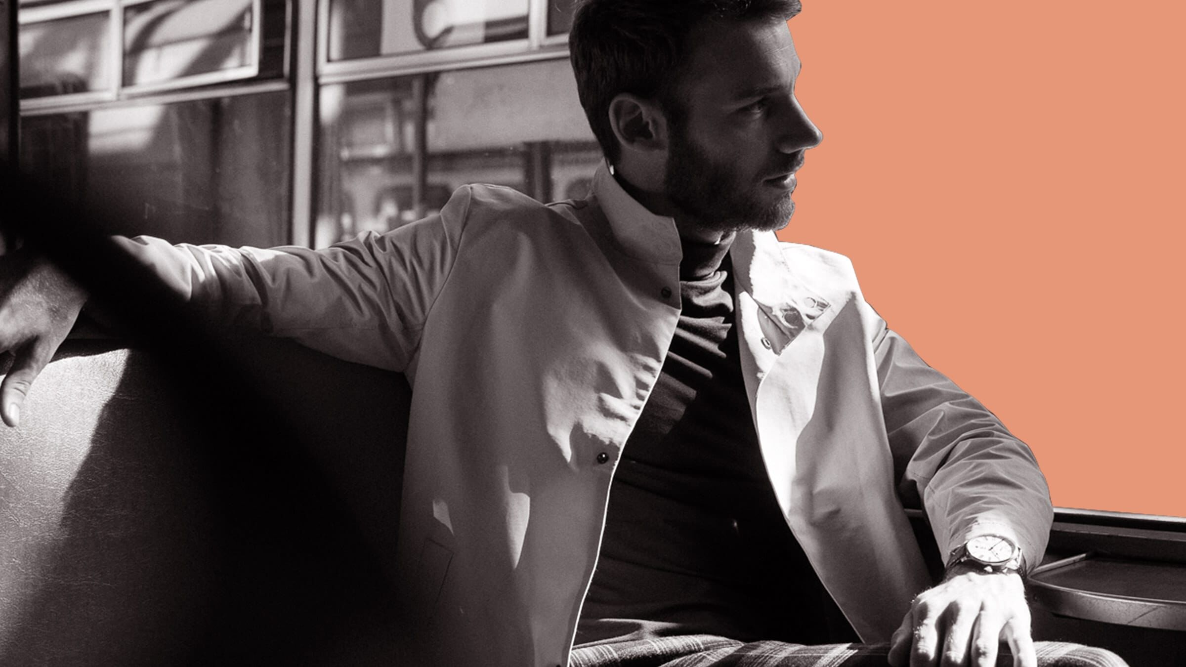
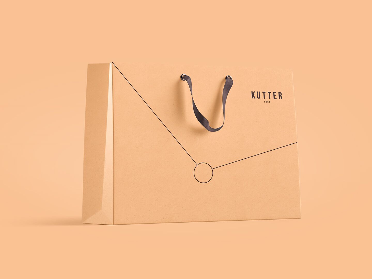
A decorative element from Kutter
A highlight developed by us: the jewellery element. It combines watches and jewellery as a distinctive feature and brand image of Kutter 1825. Reduced and focused.
A world of colour from Kutter
Peach
- R 255
- G 184
- B 135
#FFB887
Kakao
- R 67
- G 46
- B 47
#432E2F
Terracotta
- R 230
- G 151
- B 120
#E69778
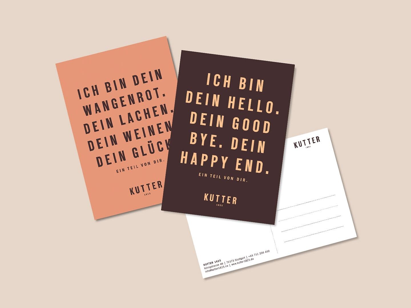
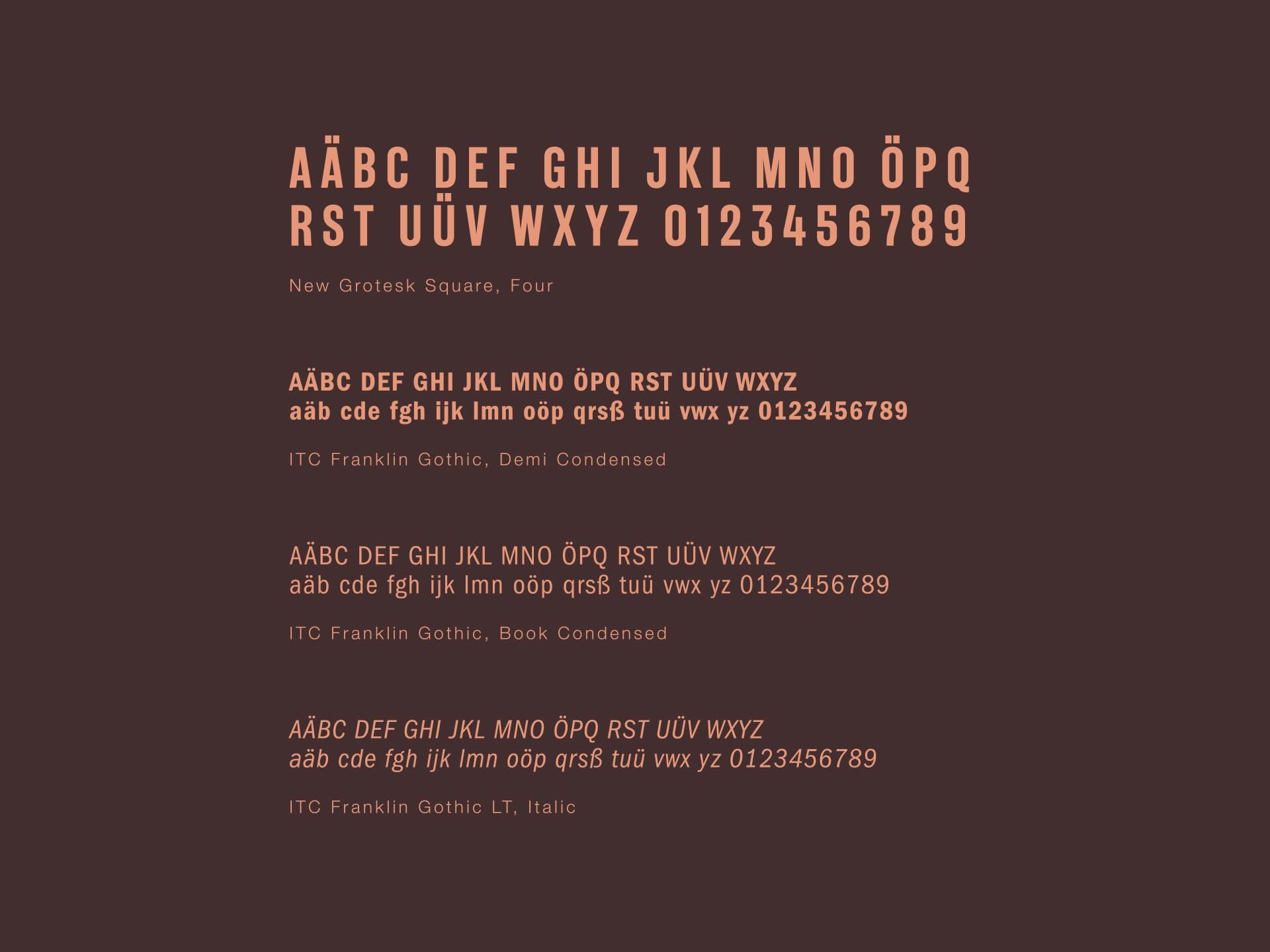
A script for Kutter
To ensure that Kutter's stories are also easy to read, we have chosen two special fonts for the typography. These are beautifully legible both analogue and digital and captivate with their simple elegance.
A performance by Kutter
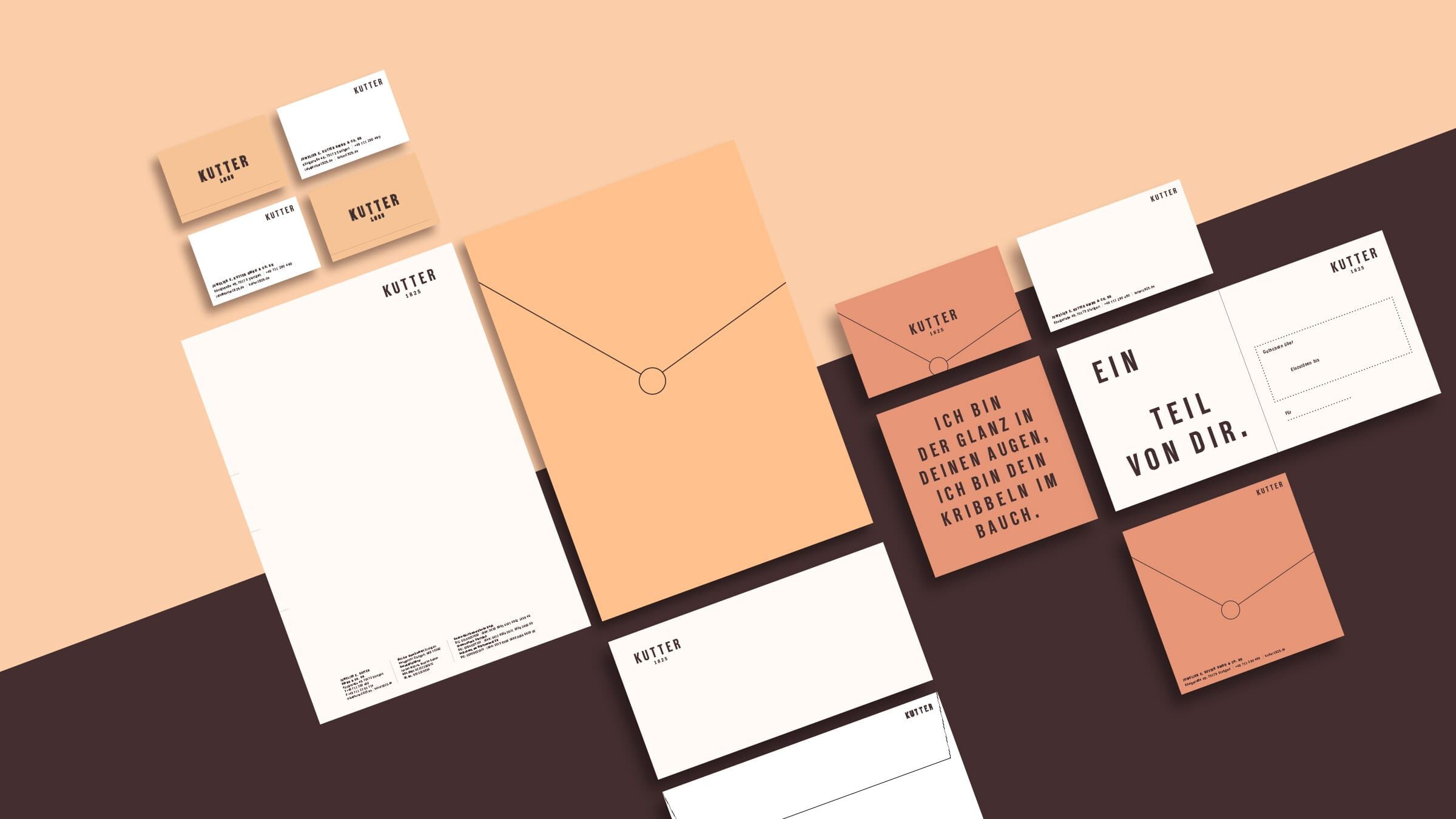
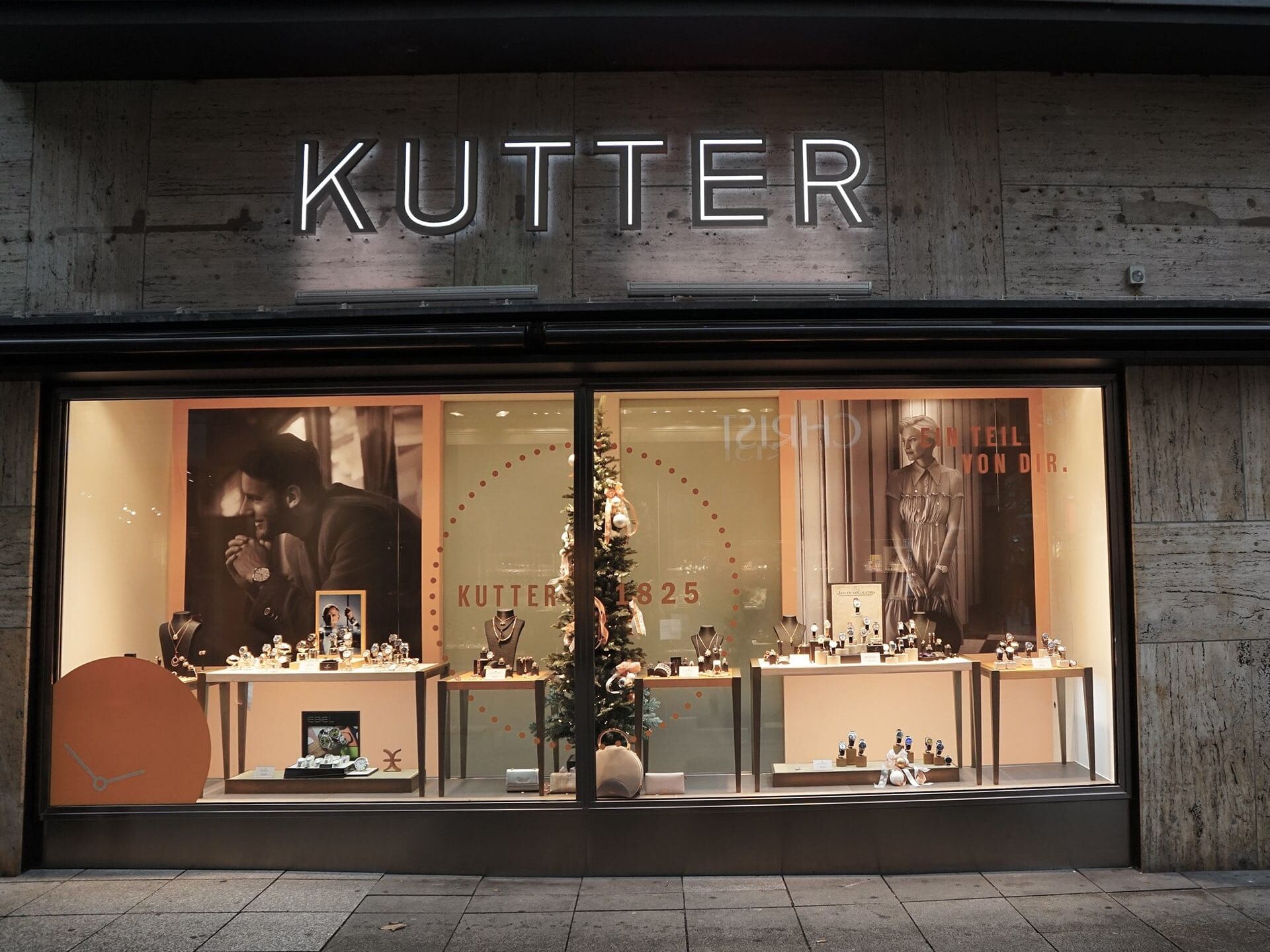
All design elements and the newly developed brand communication flow into accompanying measures, the entire business equipment and the POS. This creates a well-rounded brand presence.
New Business
Together to the next level.