Going forward, vbs.immo positions itself internally and externally as a dynamic and modern generalist. This required a comprehensive rebranding — from redesigning the logo and developing a new, more emotional claim to refreshing the website.
VON HELDEN UND GESTALTEN was responsible for the complete visual and content-based repositioning.
More than Real Estate
Rebranding for vbs.immo
briefing
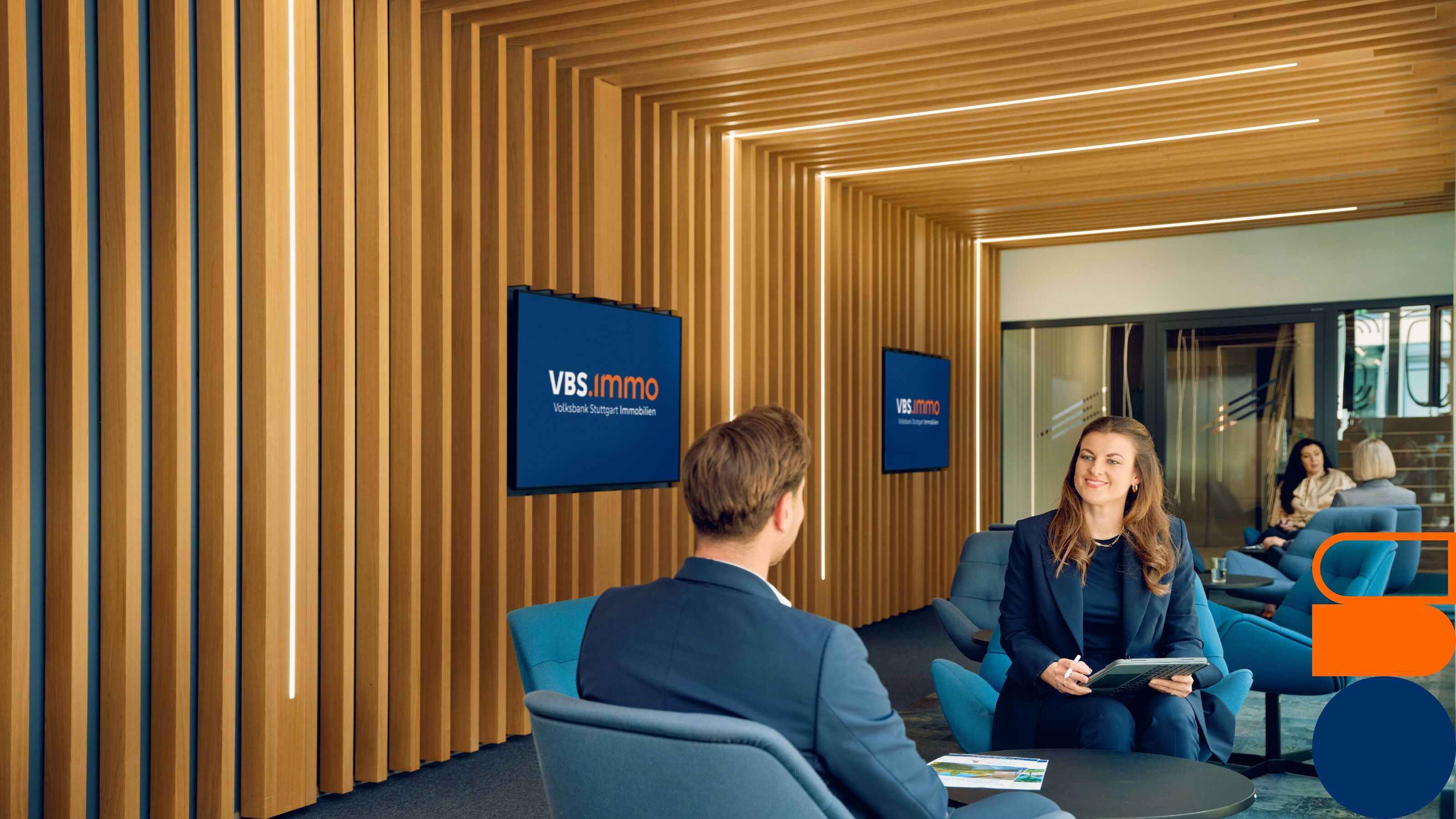
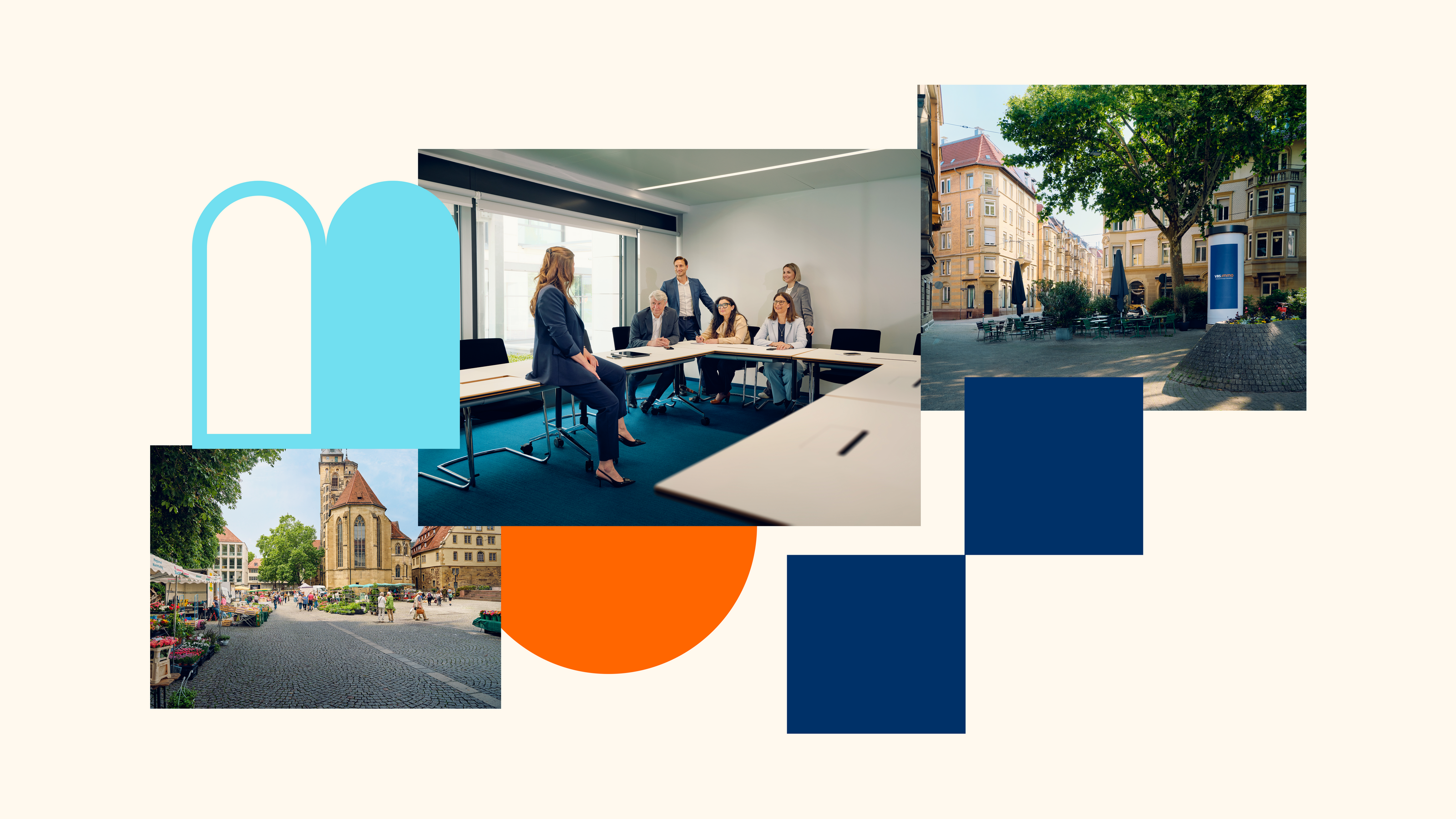
A home is more than just a place. It is a feeling. A feeling of safety, trust, and belonging. And that is exactly what vbs.immo stands for as a strong real estate partner.
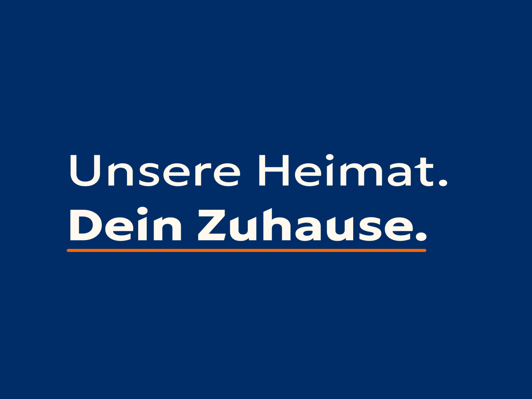
We translated this feeling into the entire brand presence and reimagined vbs.immo with a more emotional visual world, a modern redesign, and a warm tone of voice. In doing so, we made the brand promise tangible across the website, social media, and the new claim: “Our home. Your home.”
Categories
Consulting
A modern generalist
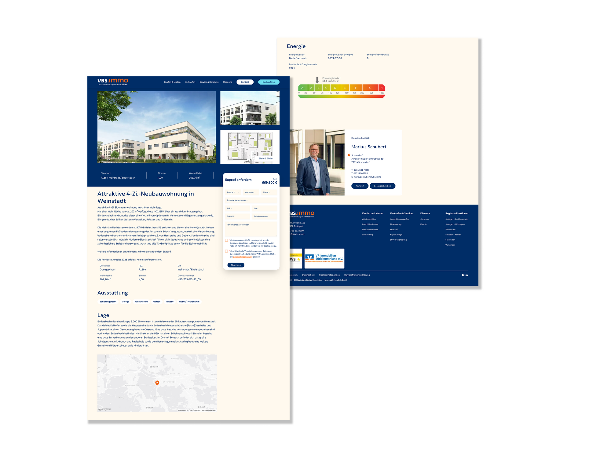
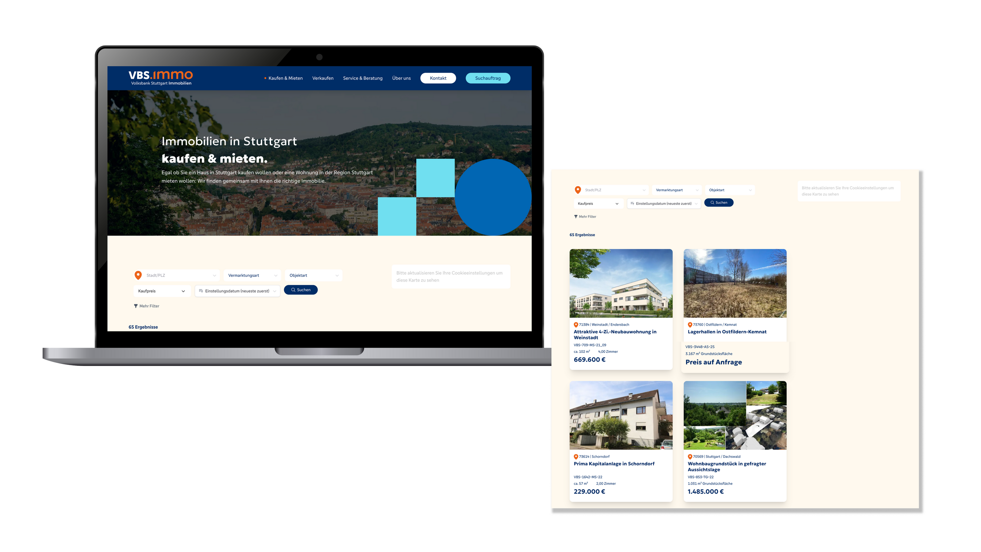
Refresh also digital
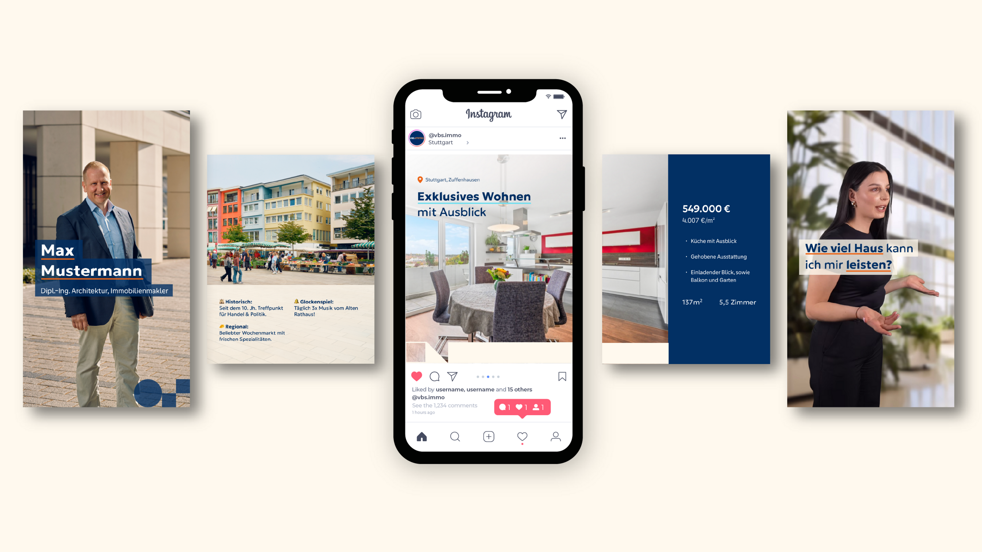
vbs.immo will also present itself in a modern and dynamic way in the digital space. The new website impresses with a new visual language, a clearly structured layout that considers all aspects of accessibility, a new user-friendly navigation, and a more human and approachable tone of voice — while fully taking into account all relevant SEO aspects.
In addition, we gave the social media presence a more contemporary look through newly developed templates.
Rethinking Branding
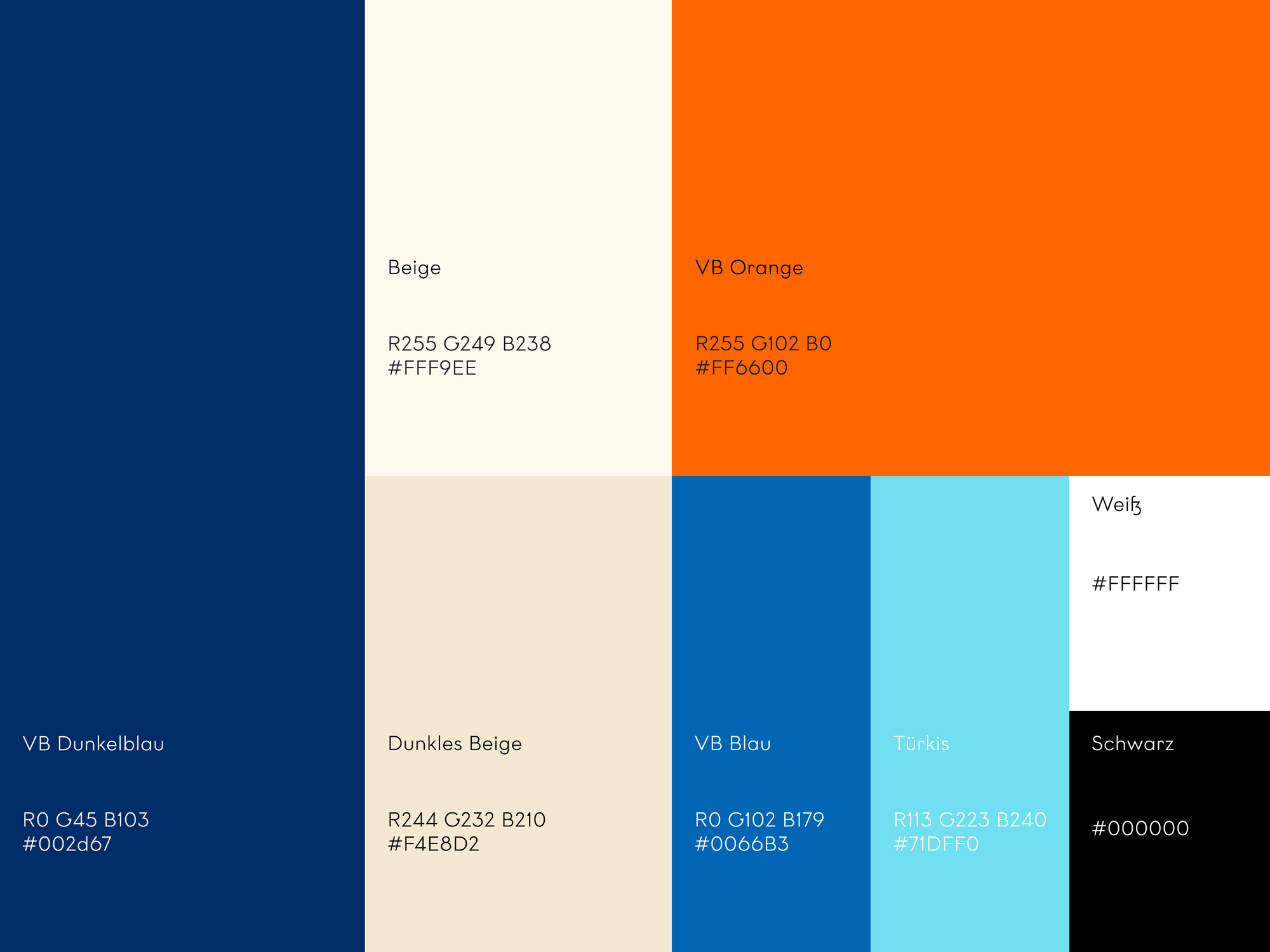
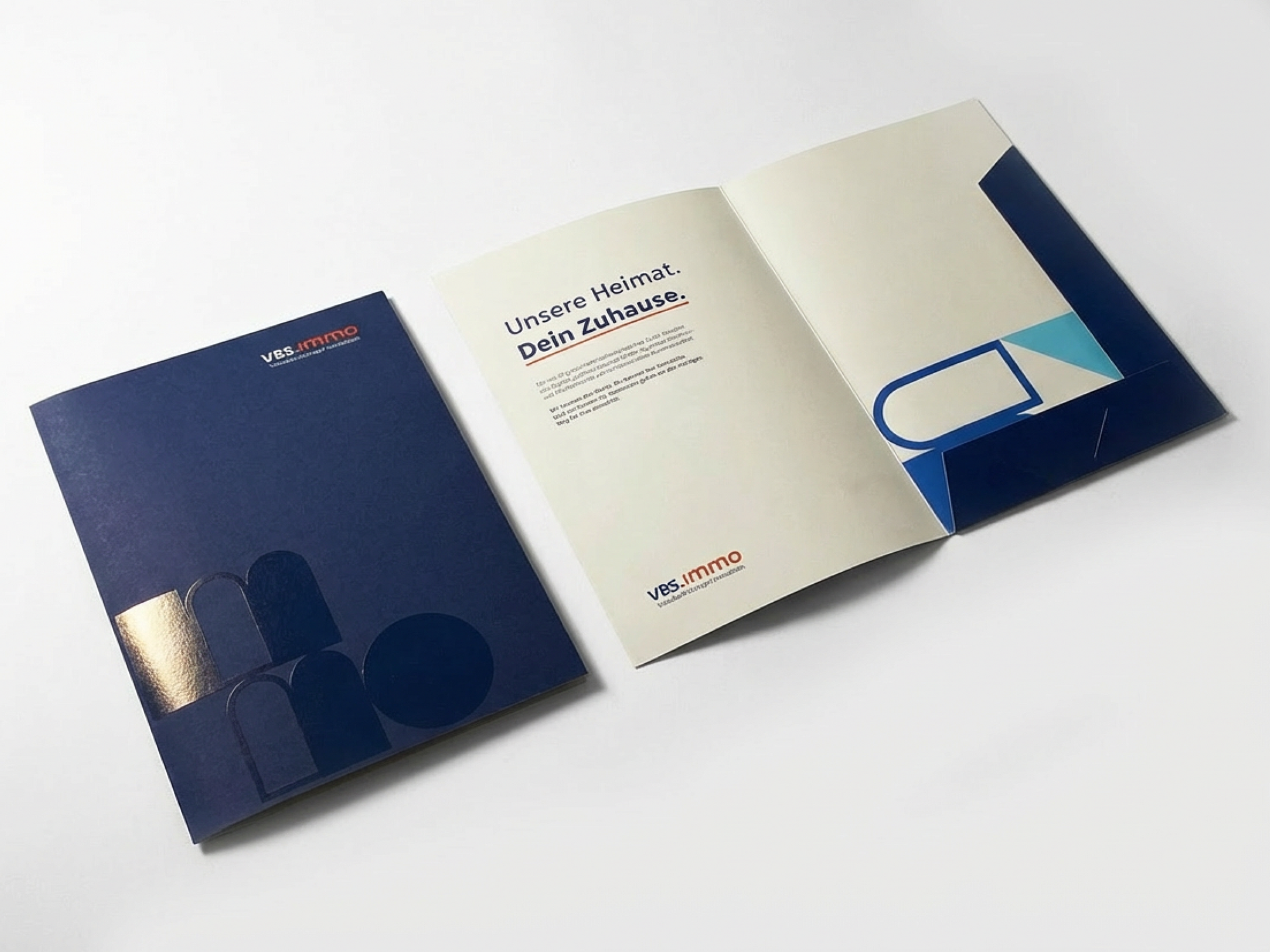
In addition to a significantly more authentic and human-centered visual concept, the corporate colors were carefully evolved. Stronger tones of the two core colors, blue and orange, as well as VR Ultramarine were introduced.
The result is a modern, professional look that simultaneously convinces with a warm and emotional visual language, placing employees and the region at the center.
Content in a new Look
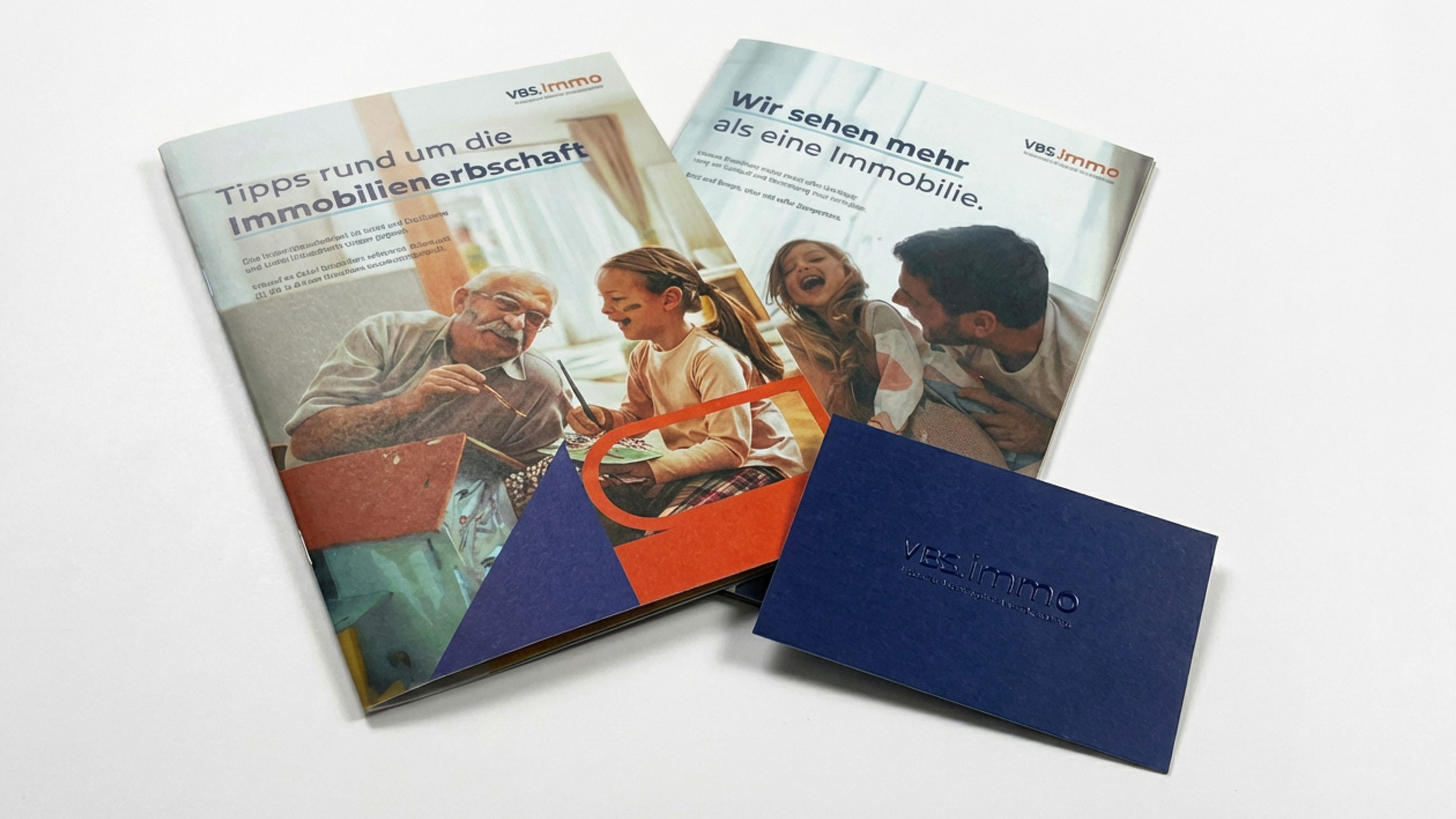
vbs.immo is the strong partner for all matters related to real estate. Competent advice for clients therefore has the highest priority.
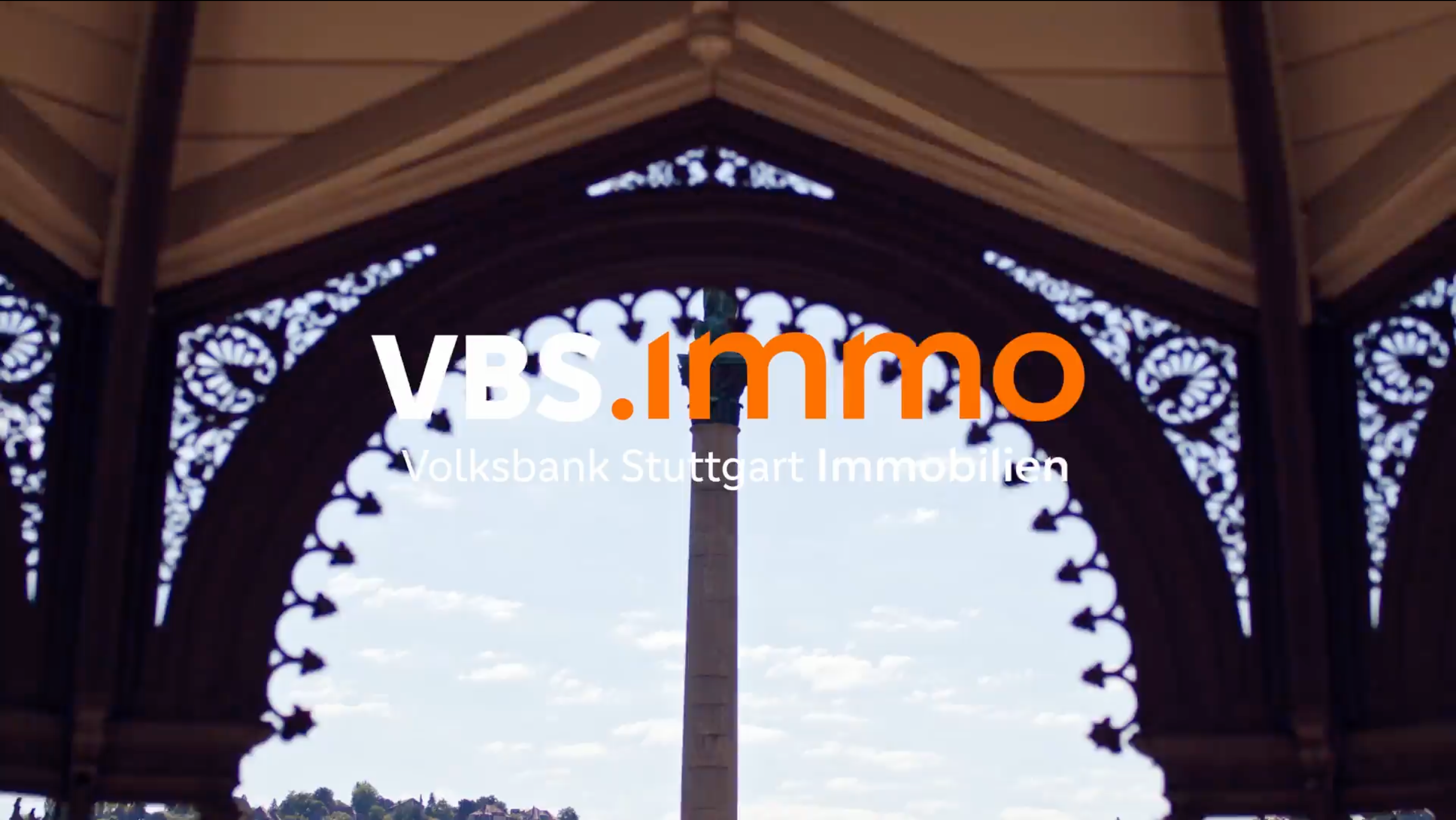
We gave this expertise a fresh appearance: with redesigned brochures, a new header film for the website, an approachable and human tone of voice, and an authentic visual world.
From Volksbank Stuttgart Immobilien to vbs.immo!
What may look like a new name and a fresh visual identity is actually the result of many months of intensive work — and just a few months ago, it was still an open question:
Who are we, really? What do we stand for — and how do we want to be perceived?In September of last year, we explored exactly these questions together with the entire team in a creative workshop. Based on this foundation, the new look of our brand was developed — because when we clearly understand who we are, we need to show it, too.
New Business
Together to the next level.