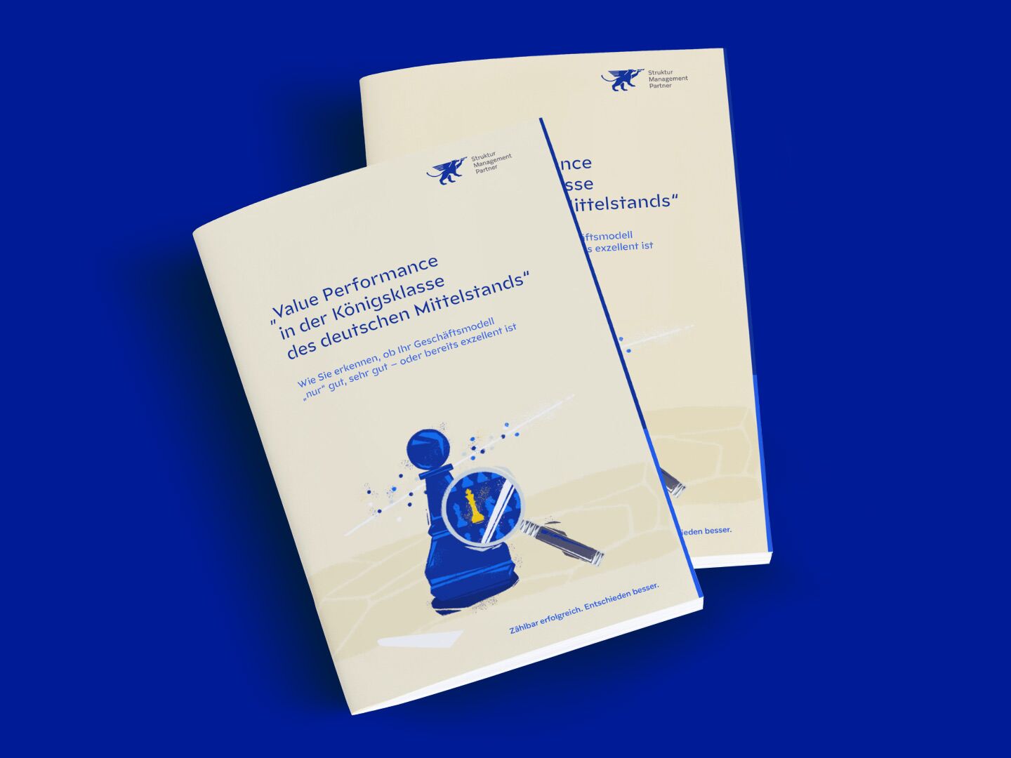
For the brand relaunch, we further developed the entire look of the brand. In addition to the facelift of the word-image brand, the lion's grasp, we developed a striking appearance especially with the illustration style. This makes it easy to break up the many contents. The combination of colours and design elements, such as illustrations or icons, stands out without blending in or distracting from the content.
For a unique oddity
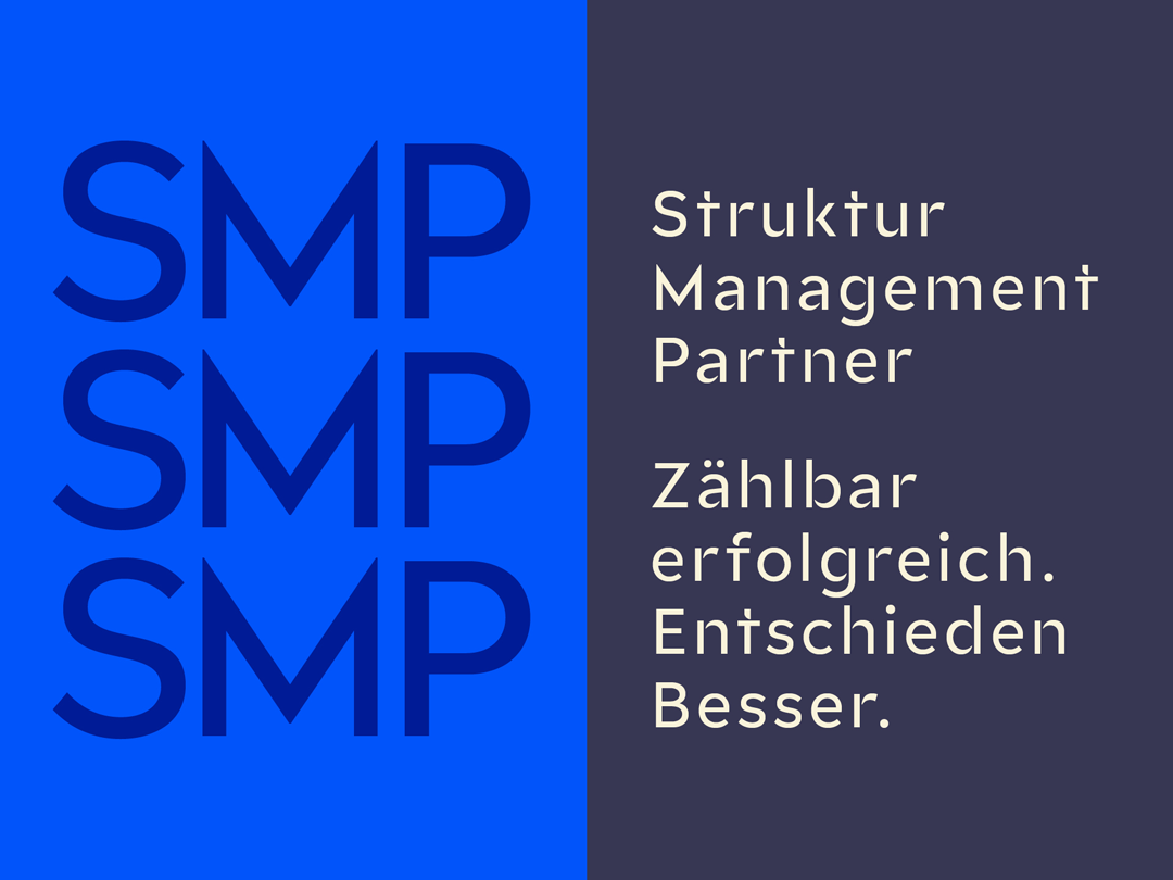
Struktur Management Partner
briefing
Struktur Management Partner is a management consultancy with a focus on turnaround management that has made a name for itself in the industry. In the world of management consultancies, it has always been important for this client to have a "unique oddity" visually. This factor was also crucial for the planned brand development. That's why we worked together to develop a complete brand relaunch that takes the brand's distinctiveness to the next level. And is noticeable throughout the entire corporate identity.
Categories
Consulting
Visit Site
www.struktur-management-partner.comGriffin' Performance
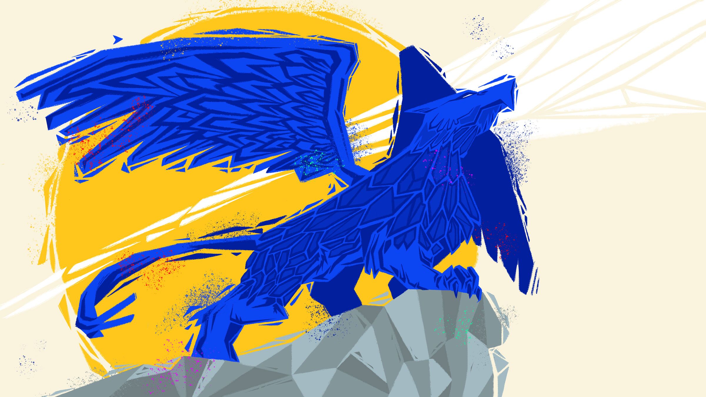
Standout look
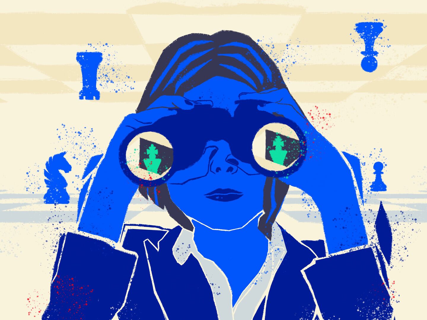
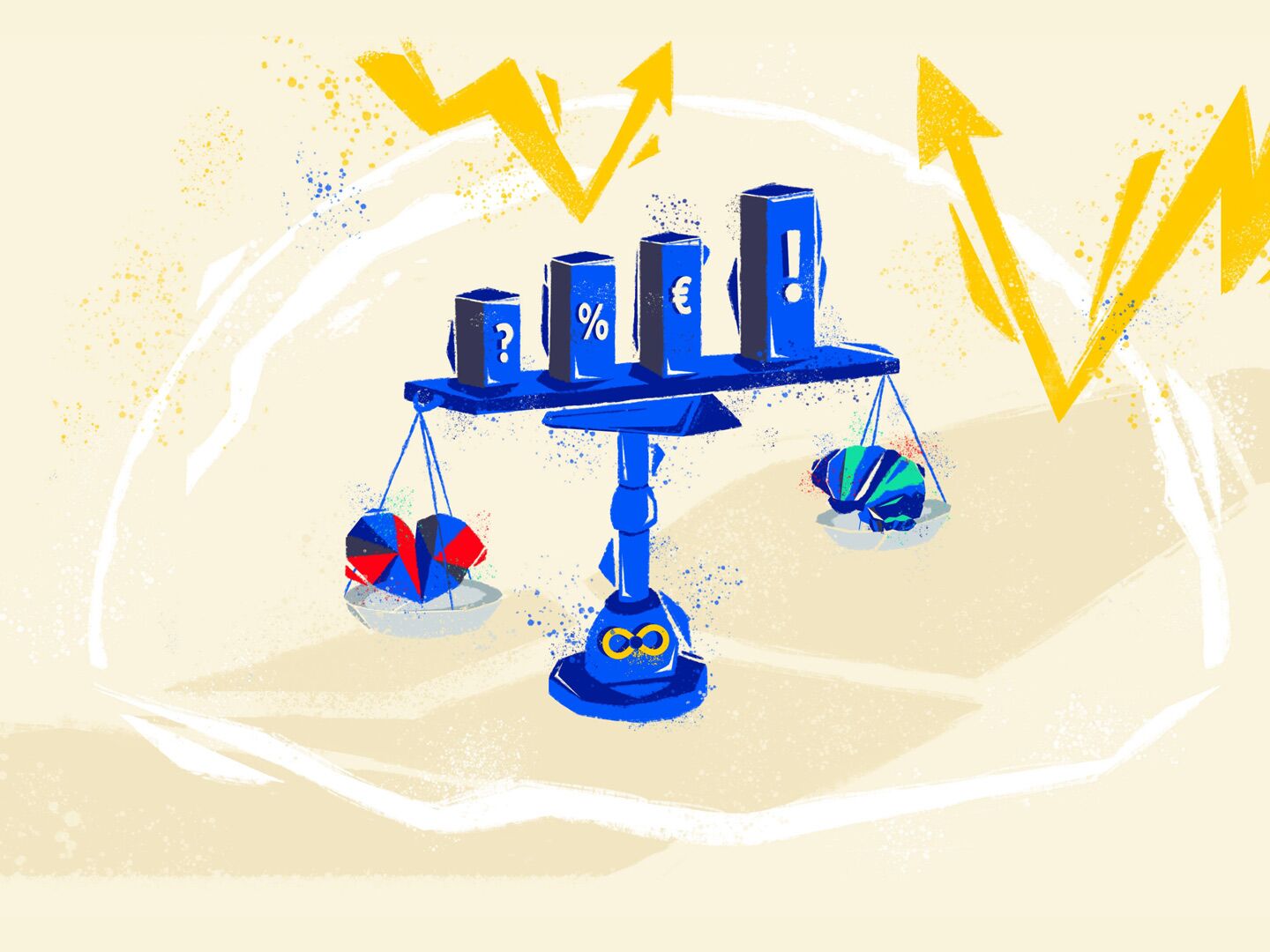
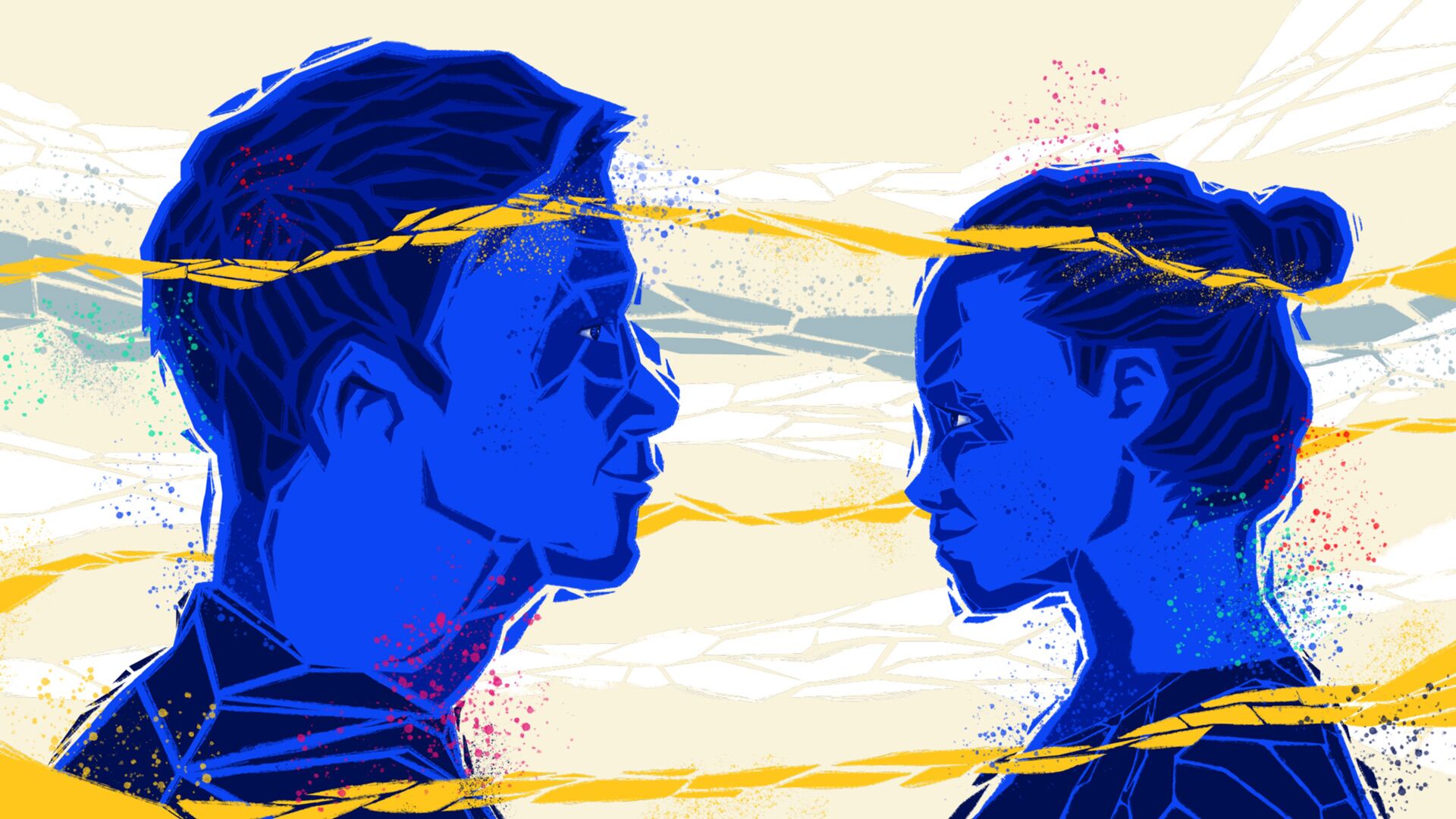
Particularly striking in the new brand identity for Struktur Management Partner are the numerous illustrated elements. Each illustration has a playful intelligence that supports rather than merely accompanies the content. And deliberately stands out in this environment.
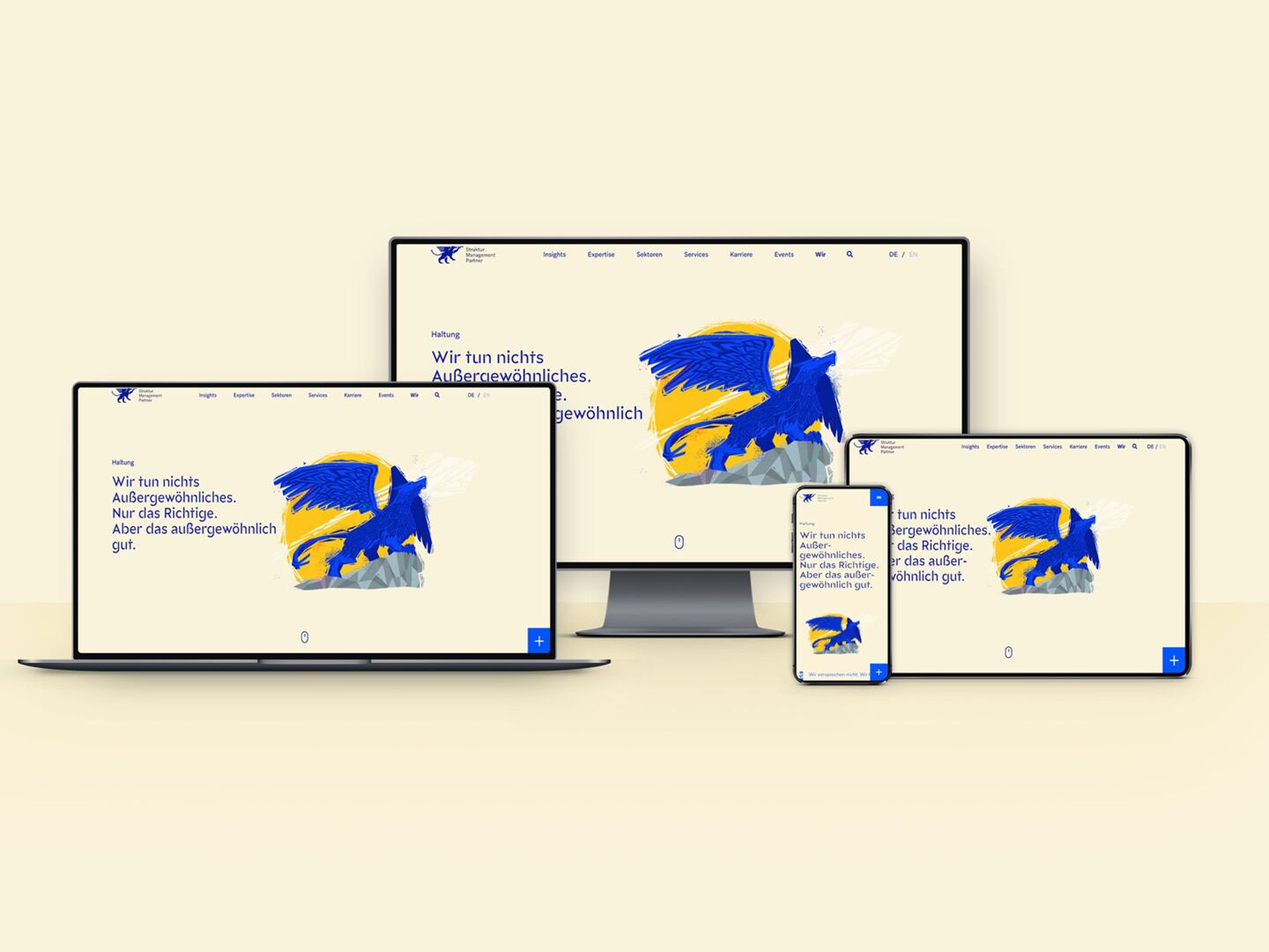
Welcoming Website
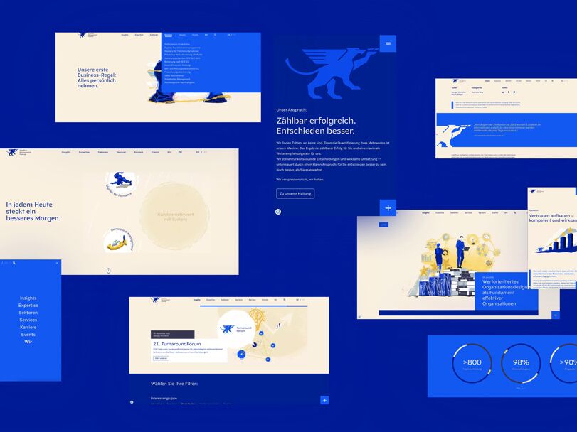
Nothing is left to chance on the website. In a joint workshop, the topic of 'target group-oriented content' was addressed for the website. The navigation and content structure were developed in such a way that information is easily accessible. The website is built with TYPO3. This CMS is intuitive, offers many possibilities and helps to optimise page loading times. The connection to a new CRM system simultaneously provides the foundation for future online marketing measures. A chatbot will also be integrated to further improve and facilitate user guidance.
Logical development
More modern, edgier, clearer. In the further development of the logo, the focus was on giving the logo a more timeless and digital look. With clear edges, the lion's grasp symbolises attitude and clarity. Core characteristics of the brand structure Management Partner.
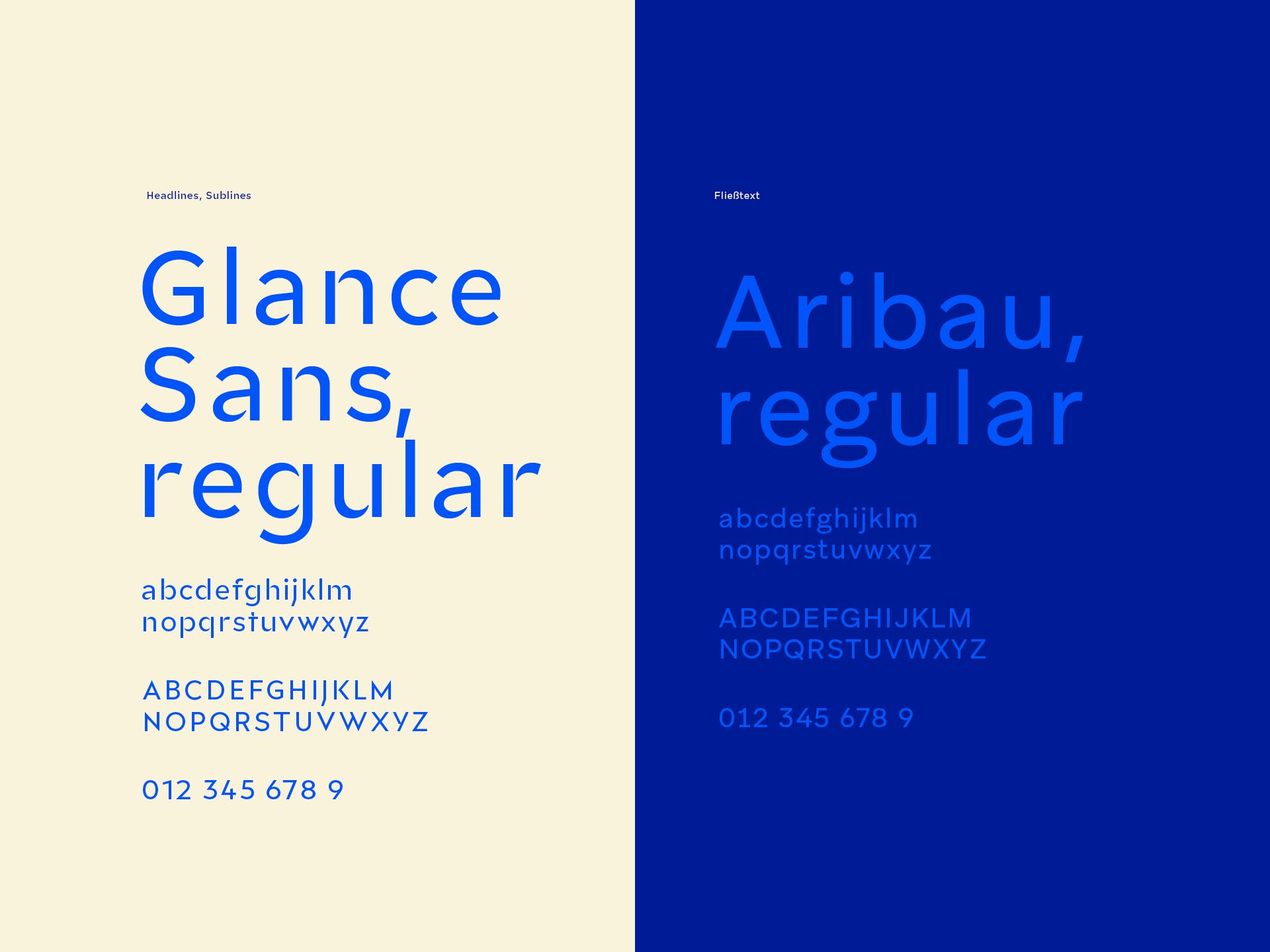
Content Clarity
The typography combines independence and playfulness with modernity. As sans serif fonts, both typefaces are very digital and focus on legibility. However, they lose none of their strength of character and also underline SMP's core values in the presentation of the content.
Structured colourfulness
Cremebeige
- R 250
- G 243
- B 220
#FAF3DC
Sand
- R 243
- G 231
- B 194
#F3E7C2
Deep Blue
- R 0
- G 27
- B 150
#001B96
Vibrant Blue
- R 0
- G 85
- B 250
#0055FA
Walnut
- R 55
- G 55
- B 84
#373754
Solid Grey
- R 207
- G 217
- B 219
#CFD9DB
Sunshine Yellow
- R 255
- G 204
- B 0
#FFCC00
New Business
Together to the next level.