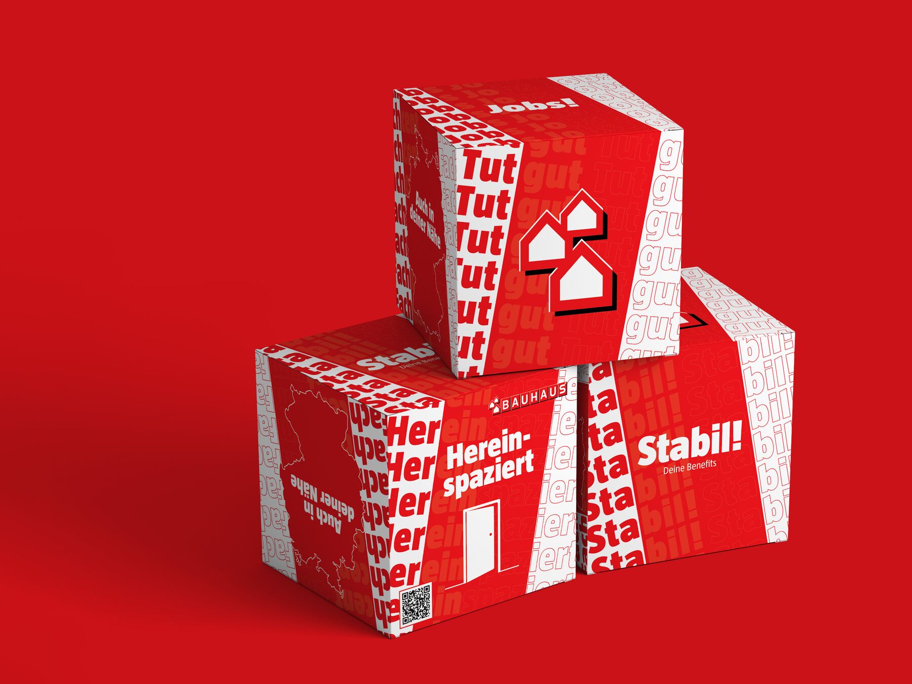
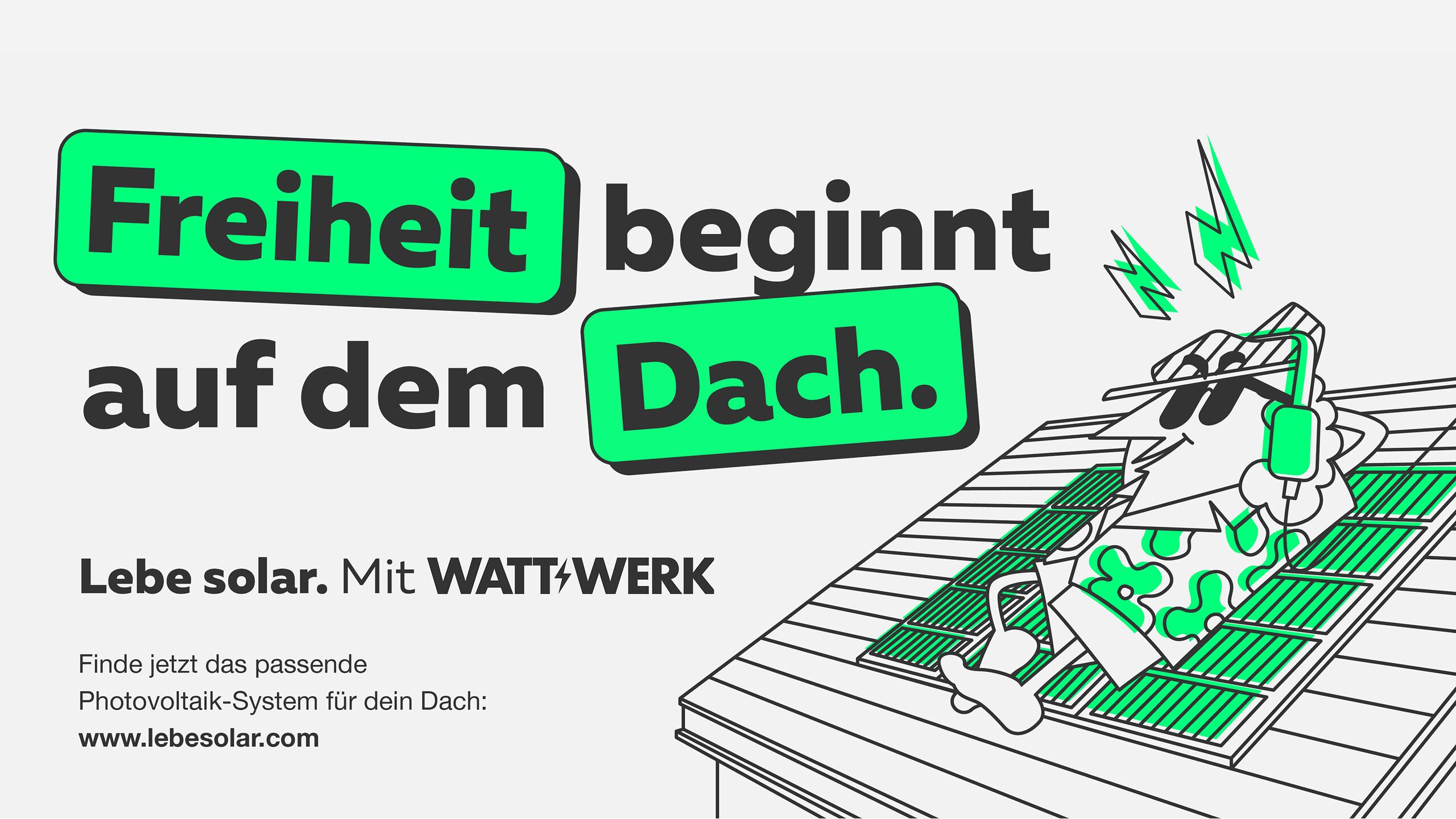
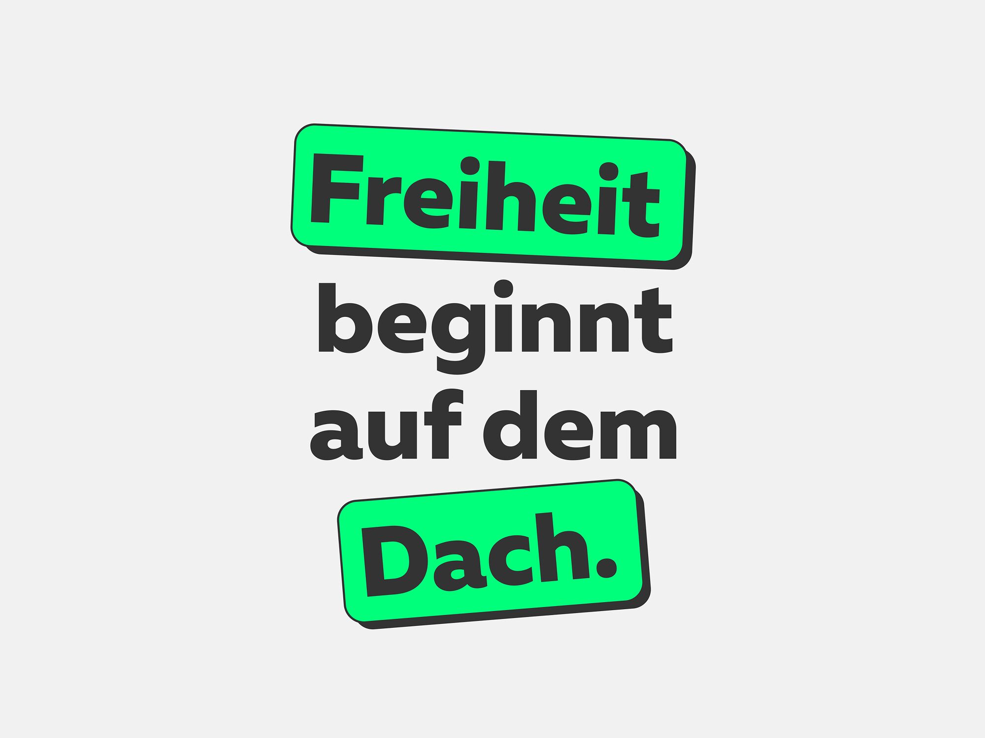
Our statements are loud and bold, and the striking design that brings every message to life fits in with this.
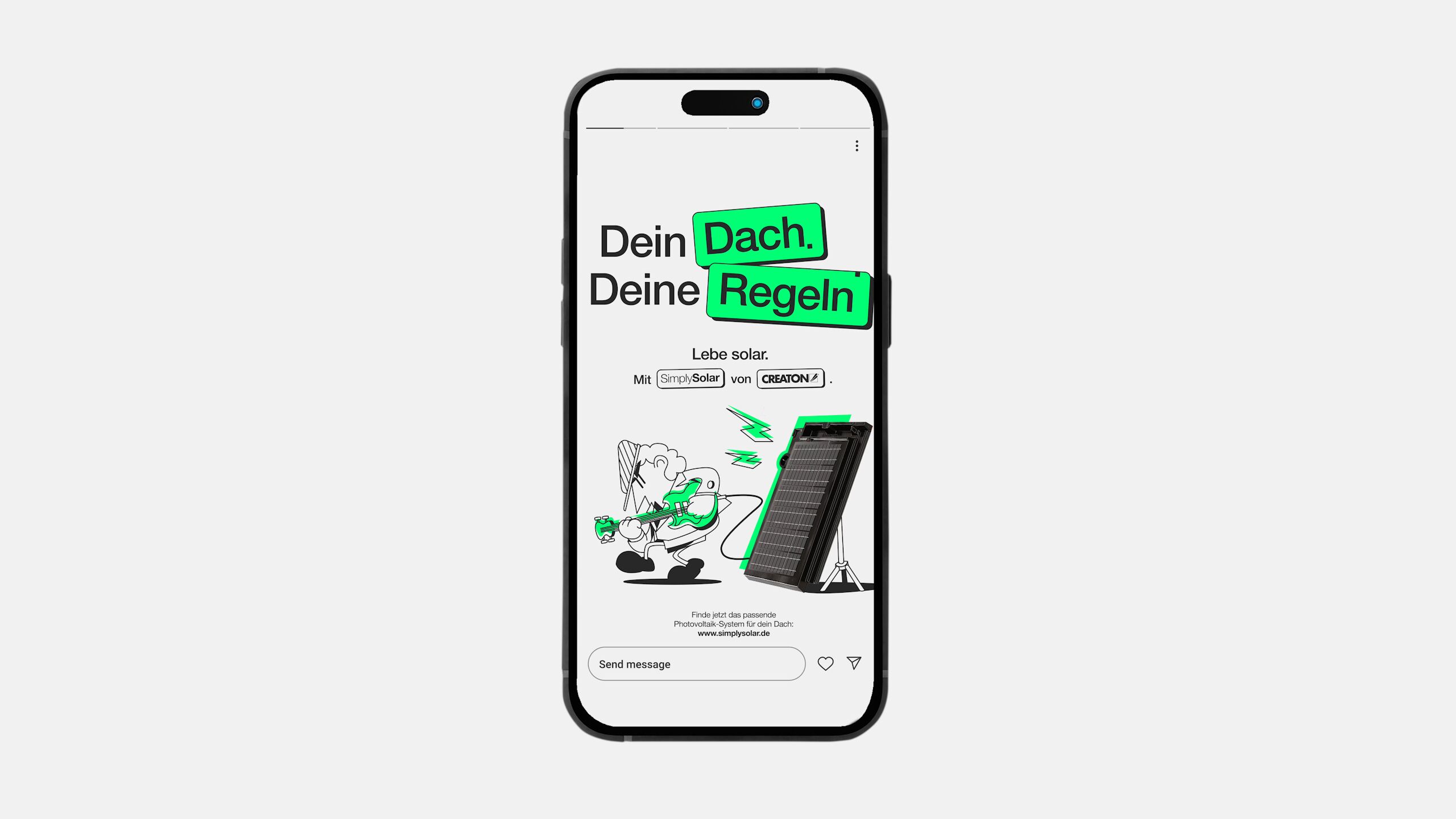
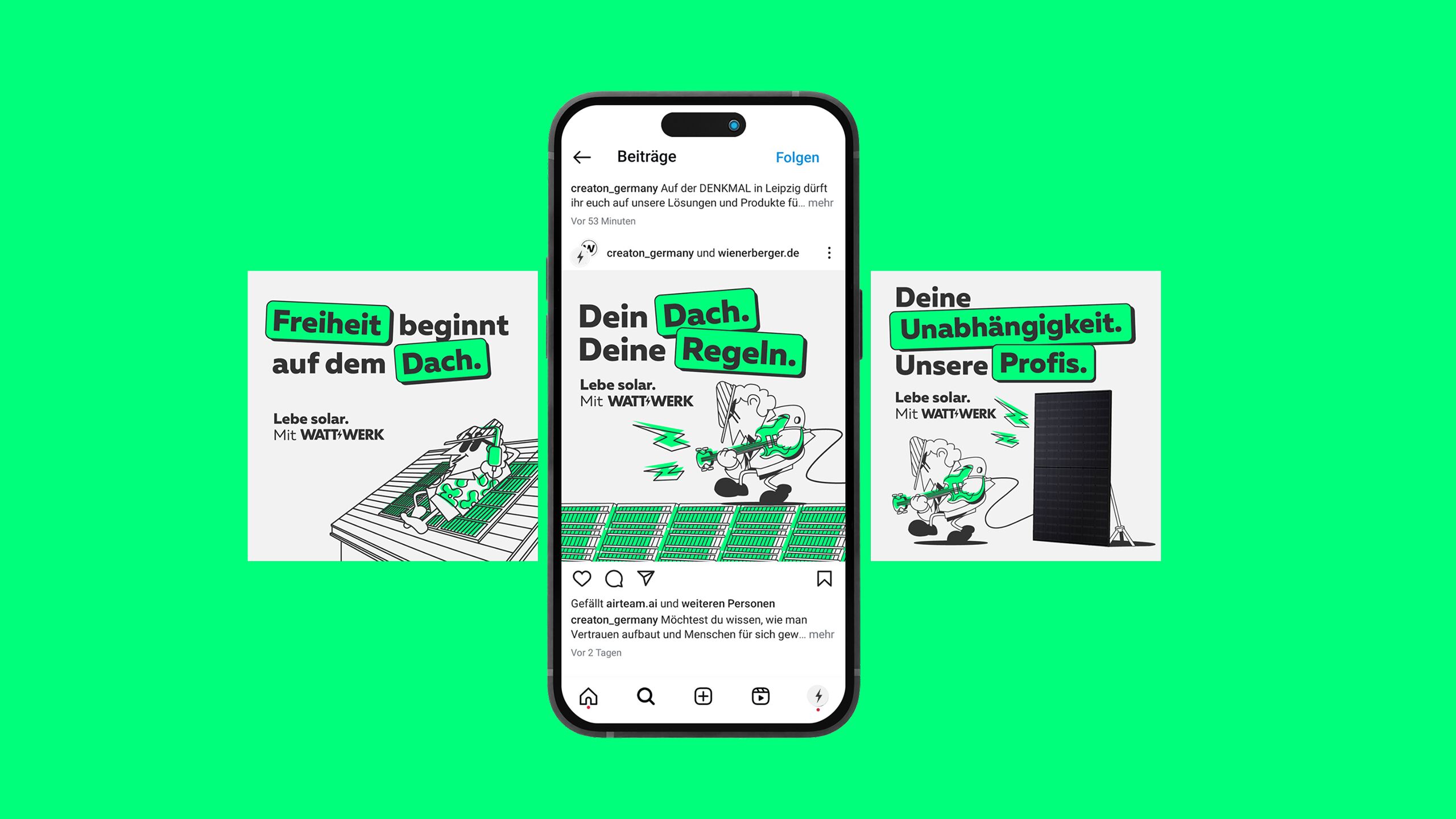
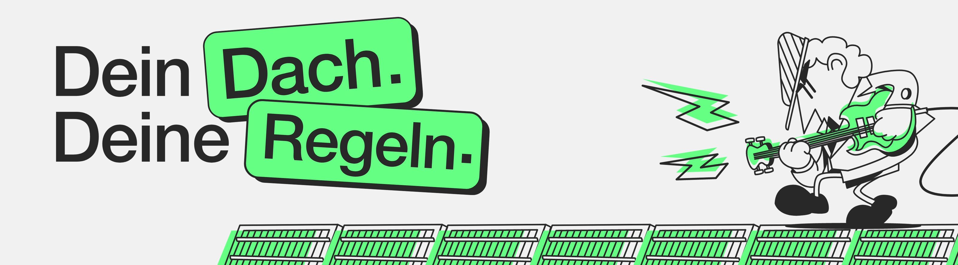
Live solar.
Wattwerk brings independence to the roof.
briefing
Wattwerk started out as a crumb with power.
Our chance to cause a stir in the solar industry with a bold, loud, provocative appearance. Not too cerebral and with a clear focus on memorable messages and imagery.
Categories
Industry
Color Palette
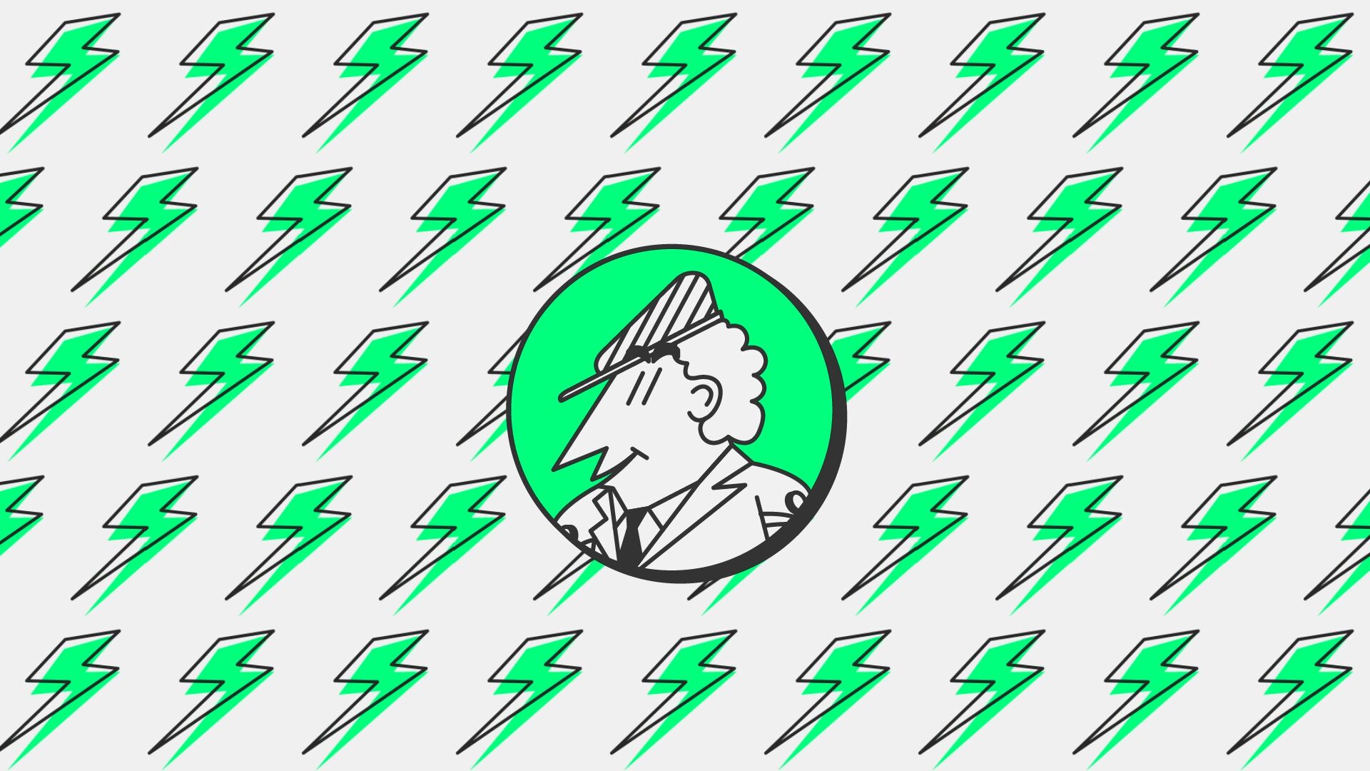
We have supplemented the existing color palette with a bright solar green. Striking and sustainable and at the same time differentiating from the color worlds of the competition.
Black
- R 51
- G 51
- B 51
#333333
Green
- R 3
- G 255
- B 123
#03FF7B
Light Grey
- R 242
- G 242
- B 242
#F2F2F2
Wherever Wattwerk is active, the competition is huge. From big players to small, agile start-ups, it's all there. And they are all flooding the market with messages and offers. Faster. Higher. Further. Or: Cheaper. Better. More efficient. With a mascot specially illustrated for Wattwerk, bold colors and provocative statements, Wattwerk clearly stands out from the crowd with our campaign. All under the motto: Live solar!
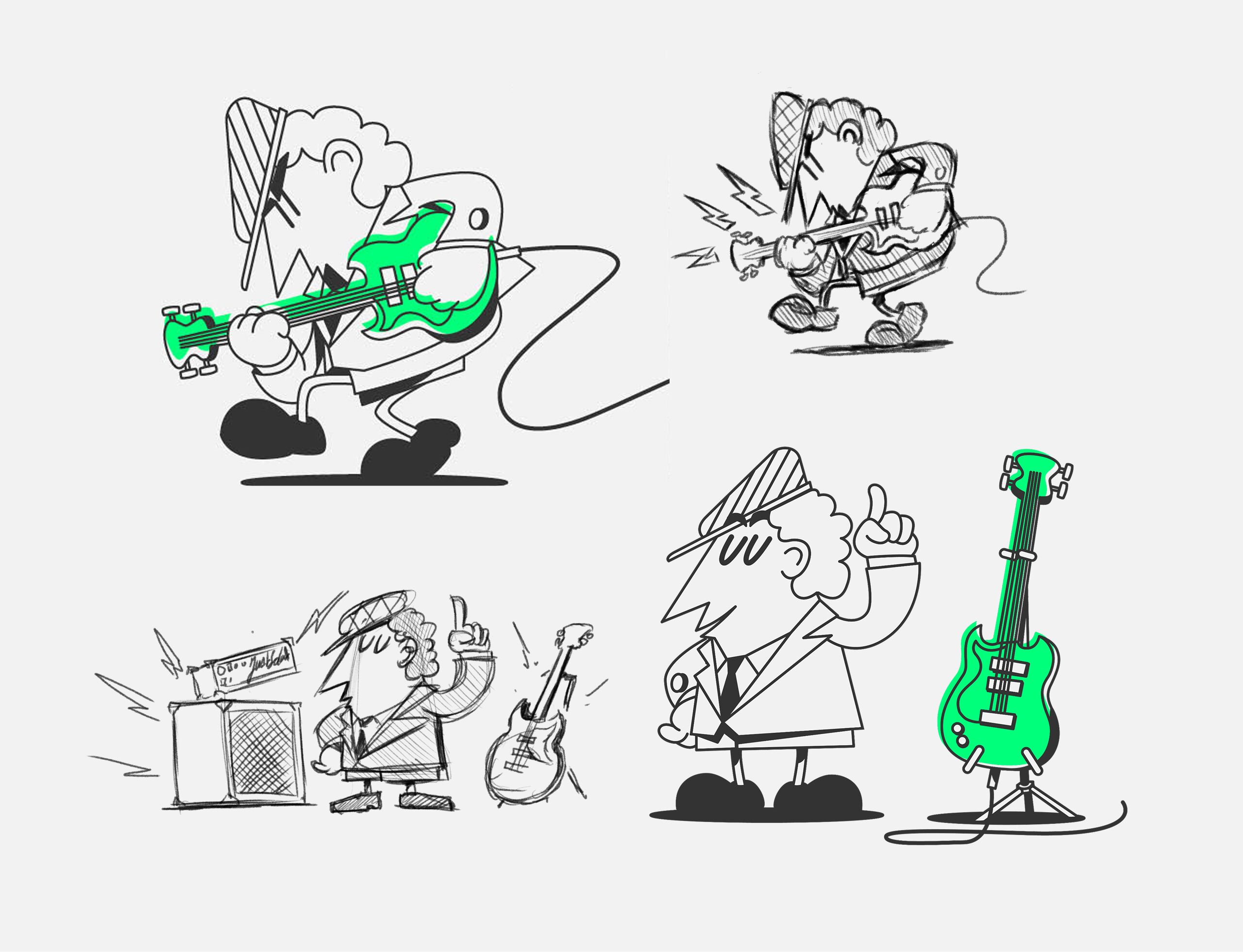
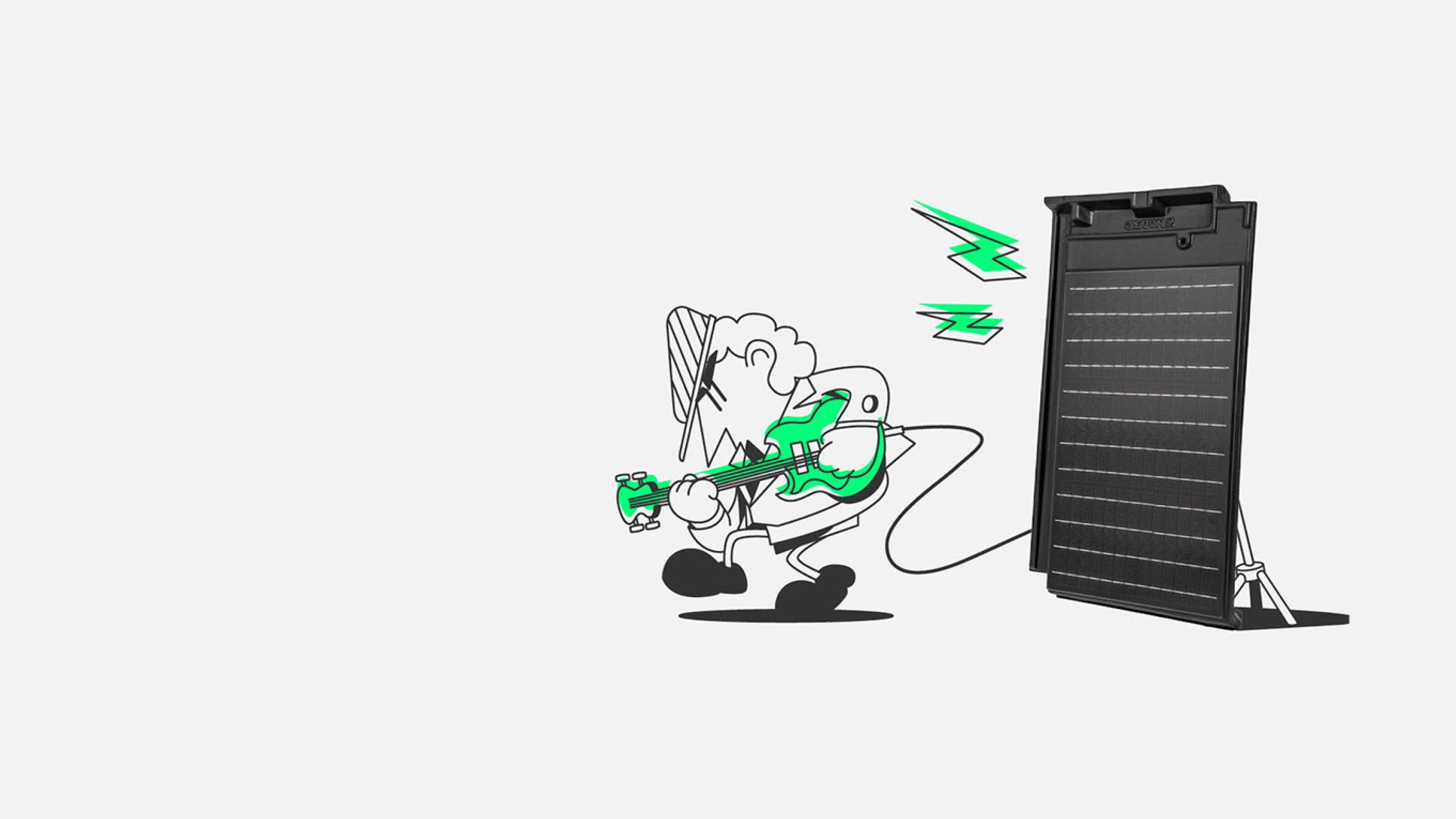
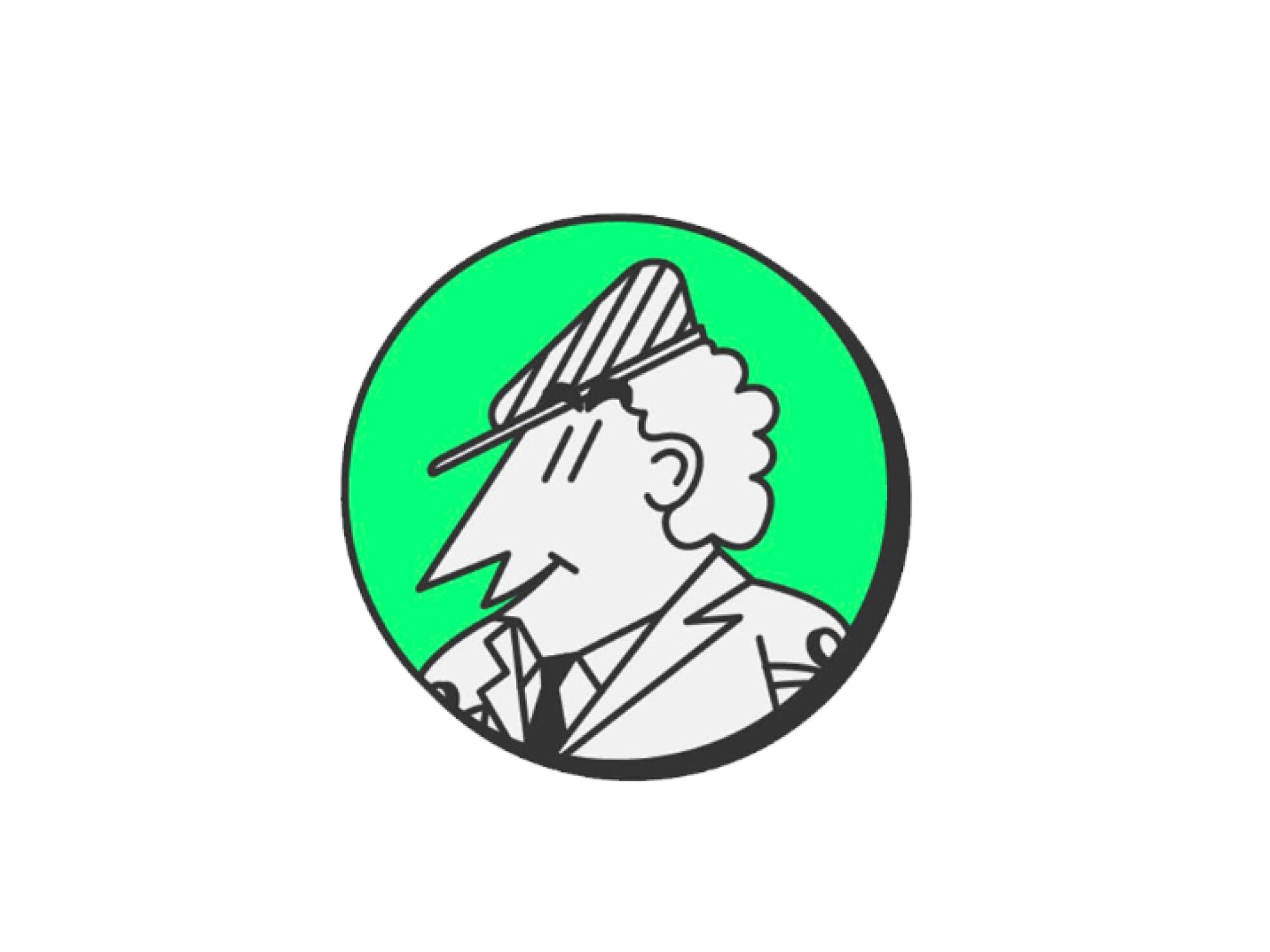
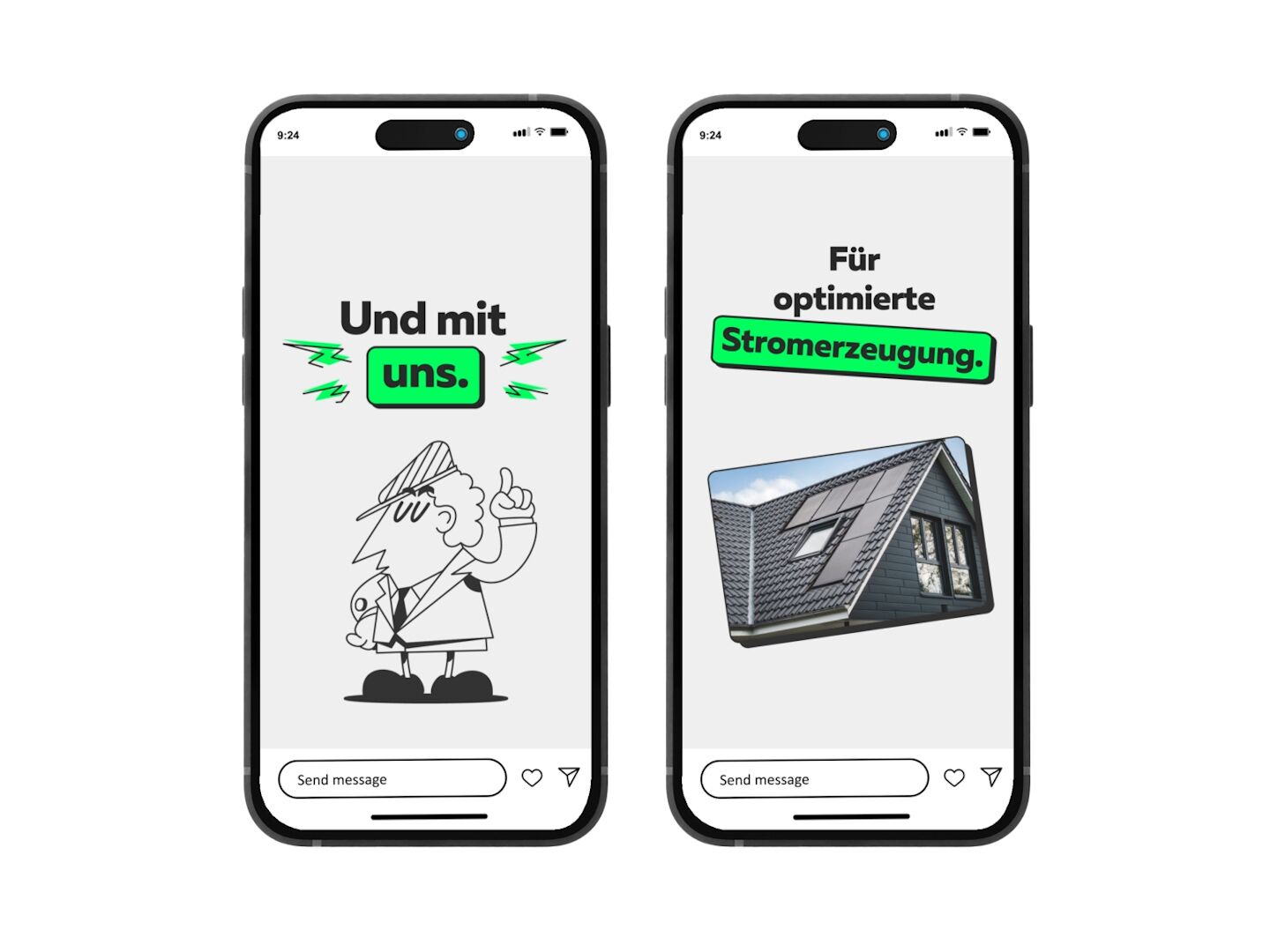
How do we create an identification, an emotional connection to the brand without running a brand campaign? With our Wattwerk man. A little man drawn especially for Wattwerk that can be used in all situations. On the roof, on the solar panels, but also on the ground. This makes the campaign, just like the brand, lively and memorable.
Nah dran
With topics that move our target group, we also place Wattwerk on the social platform. Funny, exaggerated, but always with a real connection to reality, the famous true core. This is how we package offers in creative, appealing posts. Not flat. But with rough edges.

New Business
Together to the next level.